
Pairing Guide
Pairing by shared colour palette
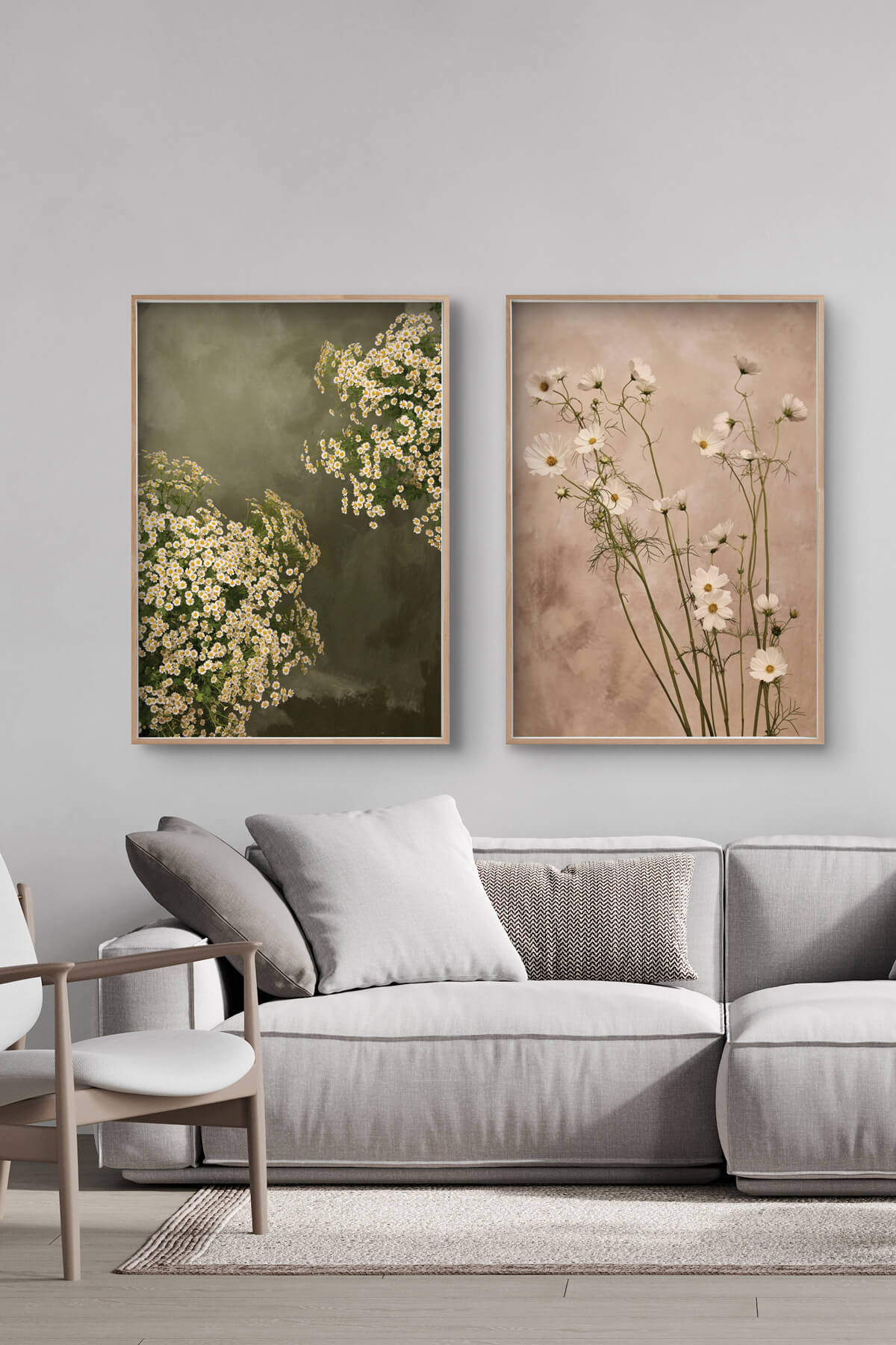
01. shared colour palette
Note: We are using A1 sizes in all our examples for simplicity
Pairing two different pieces of artwork using the same colour palette is one of the easiest ways to create a visually cohesive and harmonious display.
Even if the artworks differ in style, subject matter, or medium, a consistent colour scheme can make them feel naturally connected.
Examples of effective pairings of shared colour palette:
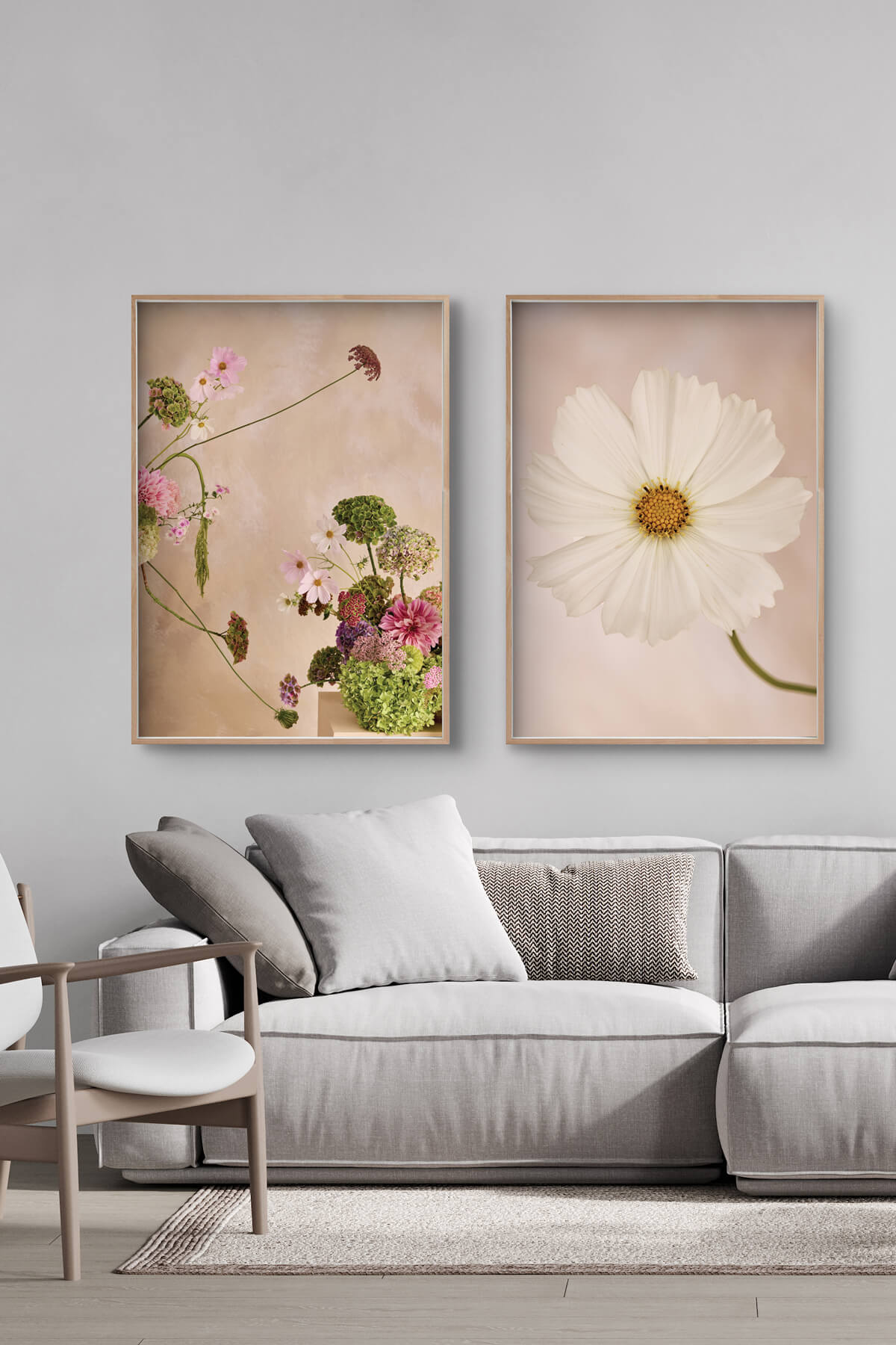
Featuring Summertime and Cosmos
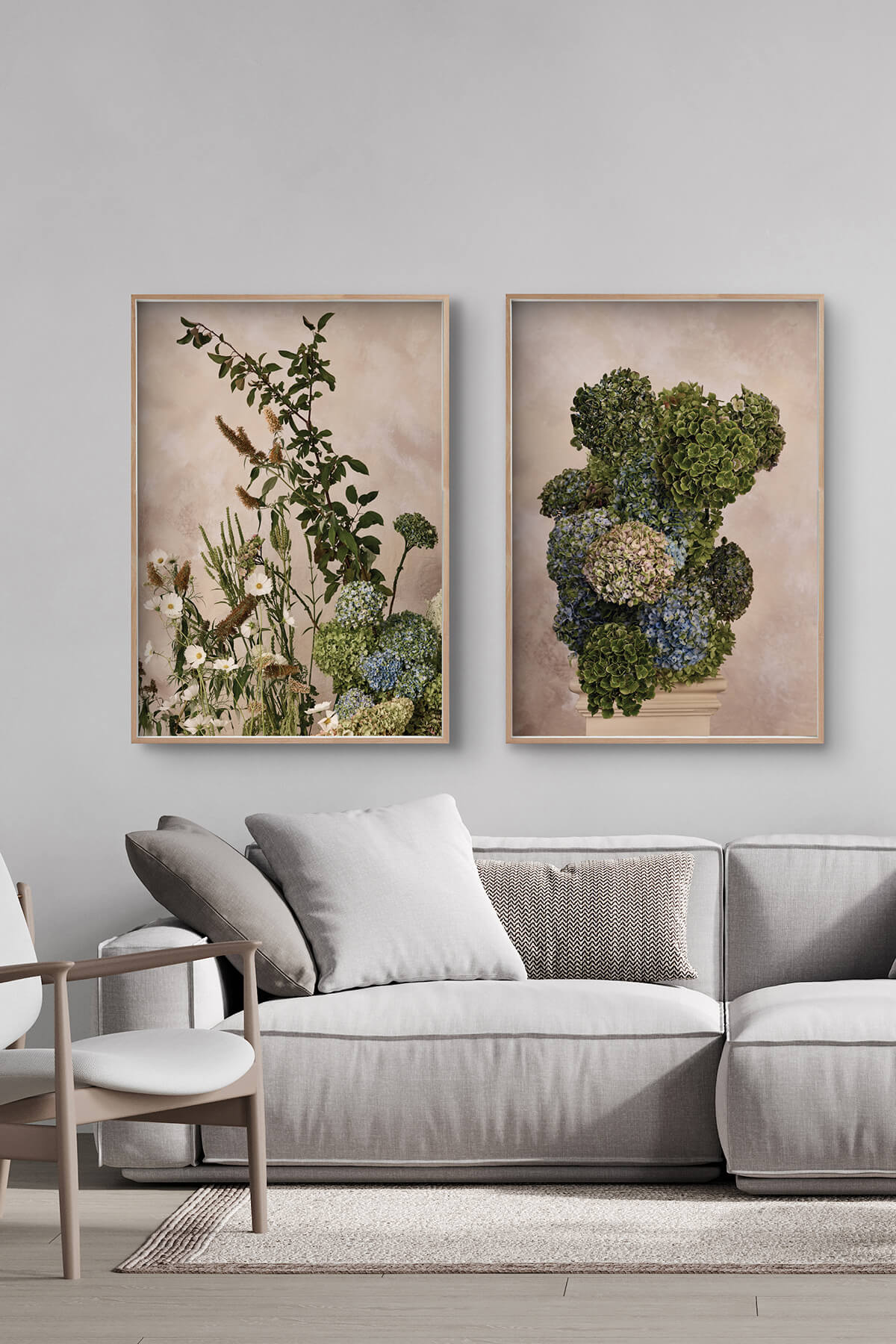
Featuring Garden State and Architect Hydrangea
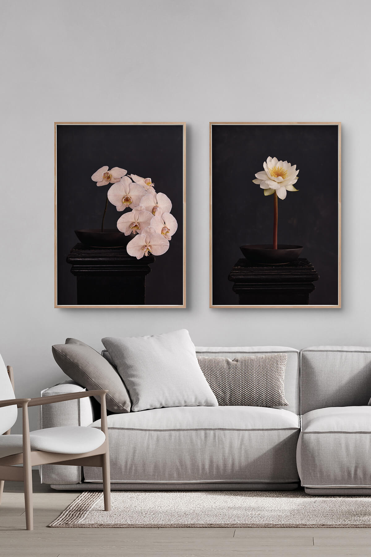
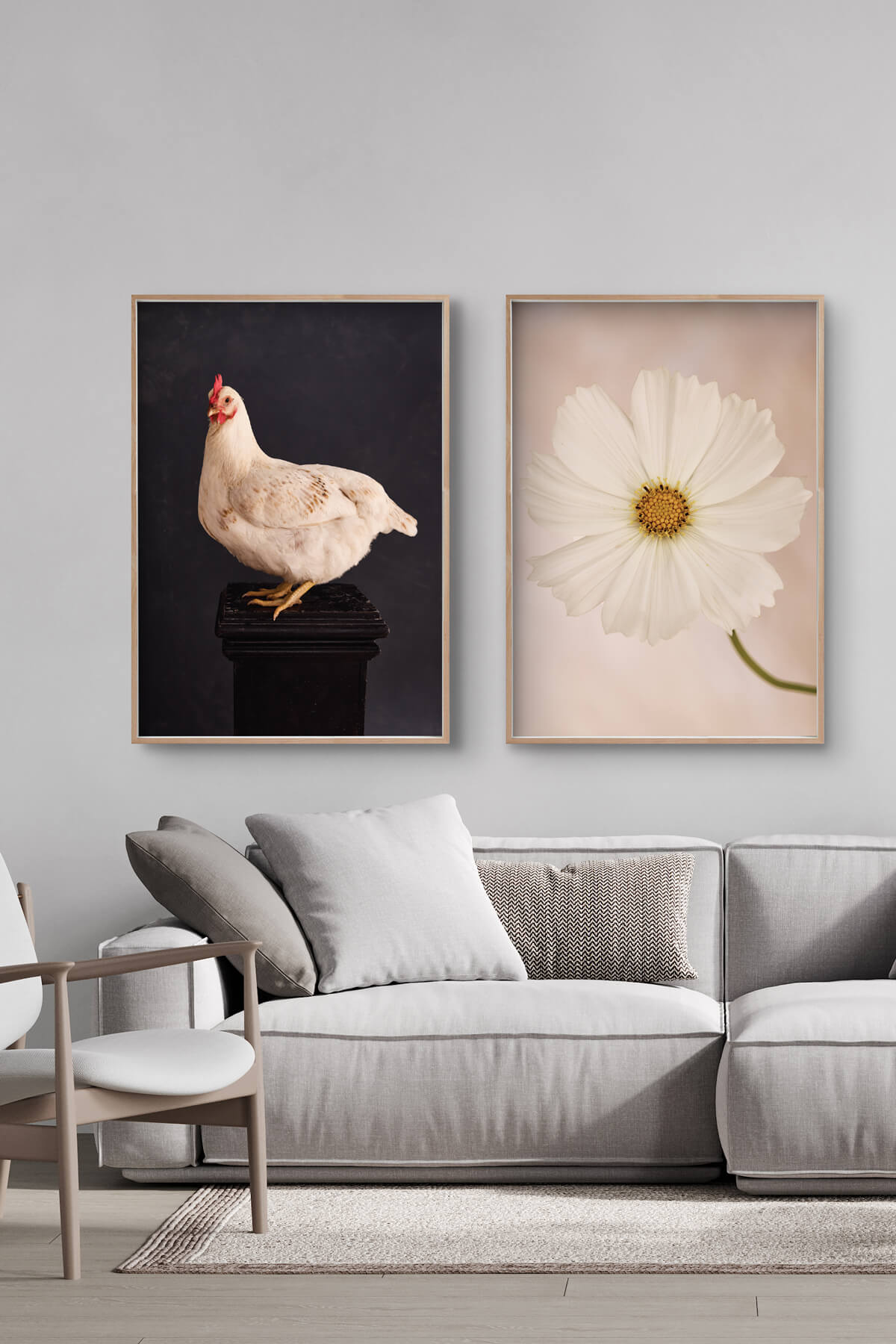
Featuring Phalaenopsis and Water Lily
Pairing abstract with abstract
02. Abstract + abstract
Pairing two abstract pieces can really amp up the visual impact of a space. The trick is striking the right balance between cohesion and contrast.
That doesn’t mean they need to have the same colours; mixing things up can actually make the display more bold and interesting. The key is finding other ways to tie them together, like similar composition, movement, texture, or contrast.
It’s all about creating a connection without making them look too similar.
Examples of effective pairings of abstract pieces:
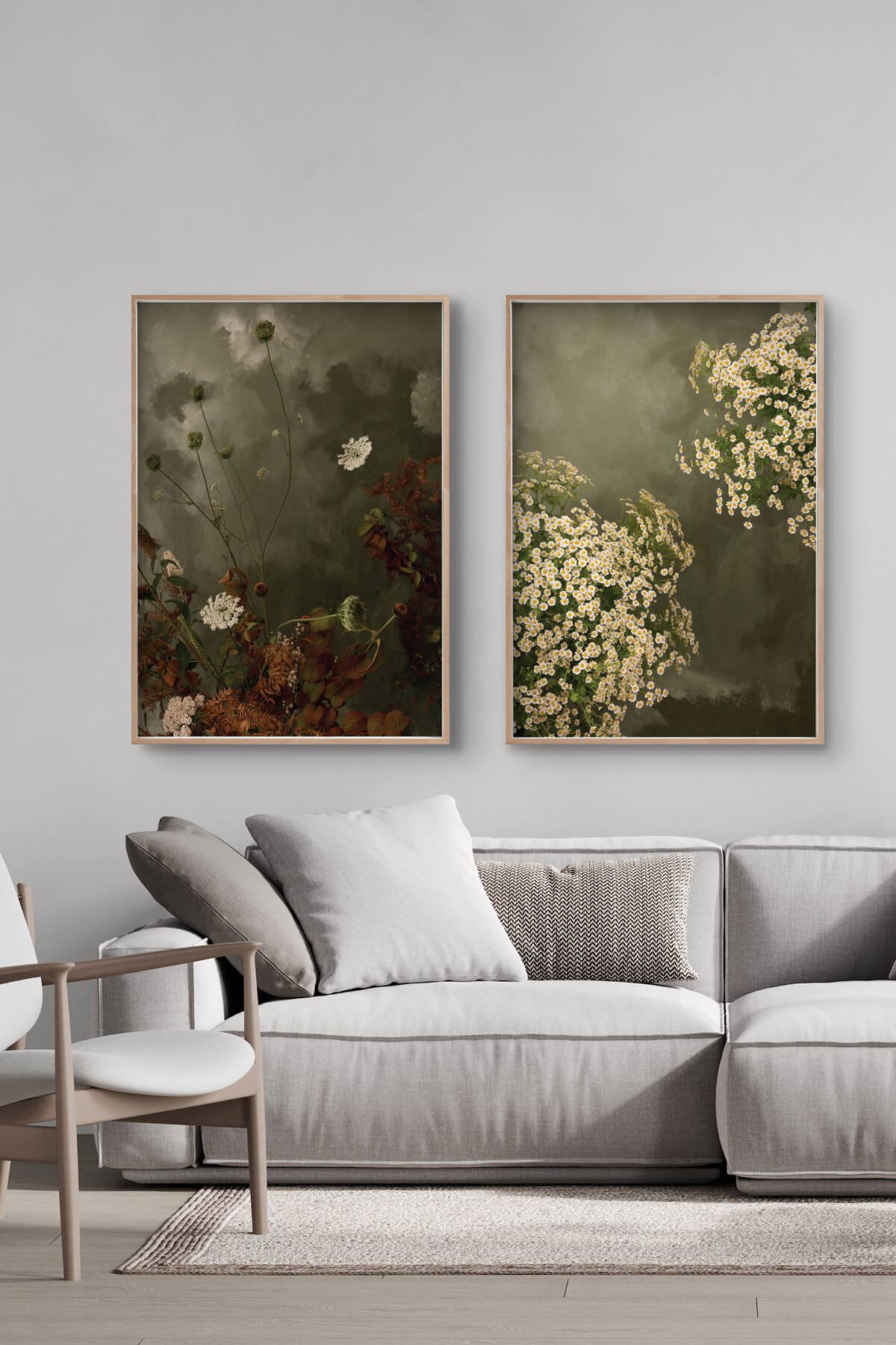
Featuring Chamomile and Wild Cosmos
Featuring Wild Cosmos and Cosmos
Pairing abstract with still life
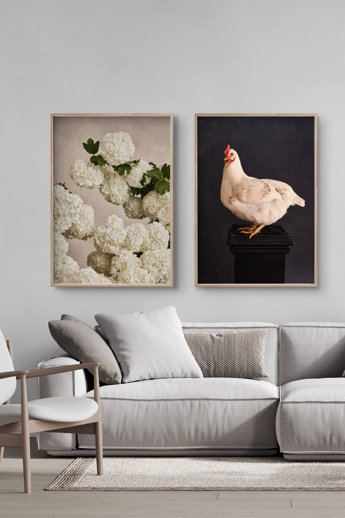
03. Abstract + still life
Note: 'Still life' refers to artwork depicting objects arranged on a plinth.
Pairing abstract art with still life can create a strikingly balanced and visually dynamic display. The contrast between the structured, recognisable elements of still life and the fluid, expressive nature of abstract art adds depth and intrigue to any space.
The key is to find a common thread between the two, ensuring they feel connected rather than mismatched.
Examples of effective pairings of abstract and still life
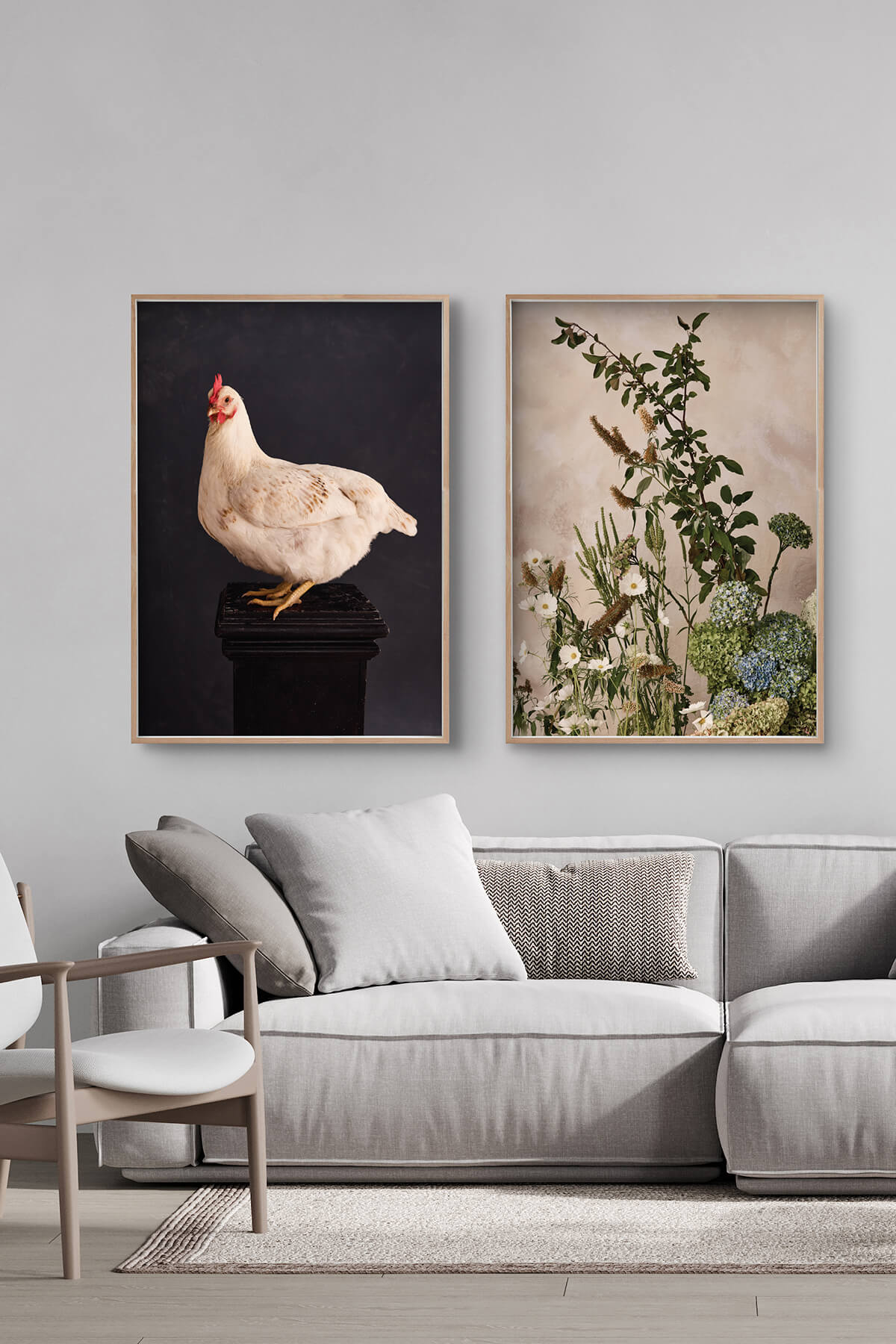
Featuring Rose and Garden State
Featuring Garden State and Architect Hydrangea
Pairing by contrasting colours
04. Contrasting colour
Pairing two artworks based on contrasting colours is a bold and dynamic approach that delivers instant visual impact. Rather than relying on similar hues for harmony, contrast allows each piece to stand out while still coming together as a cohesive display.
You can create contrast using opposite colours on the colour wheel, light versus dark, or warm versus cool tones.
Examples of effective pairings by contrasting colours:
Featuring Chamomile and Wild Cosmos
extra tips
1. Avoid pairing still life prints (usually)
Try to avoid pairing still life artworks together. While it’s not necessarily a bad idea, it can sometimes feel a bit repetitive, static, or predictable, which might make the display less visually engaging.
If you do want to pair still life pieces, test to make sure they work well together.
Example of a effective still life pairing:
Featuring Phalaenopsis and Water Lily
2. Pairing different sizes and types
You can mix and match sizes as well as the art itself. Combinations that work for two prints of the same size can also be applied to two (or more) prints of different size.
You may also pair different types; e.g., a print and a wall hanging, which have different sizes.
However, you will need to think carefully about how you intend to display multiple prints, either next to each other or placed around the room. Sometimes the best thing is simply to experiment and play around once you have the artwork on hand.
Example of a print plus wall hanging in different sizes:
Featuring Summertime and Ramble
3. Combining more than 2 pieces
You can easily create trios with our art, or combine with artwork you already have. For artworks displayed next to each other, the same sized art will generally work best, though you could have a larger print flanked by two smaller prints either side.
Example of a great trio set:
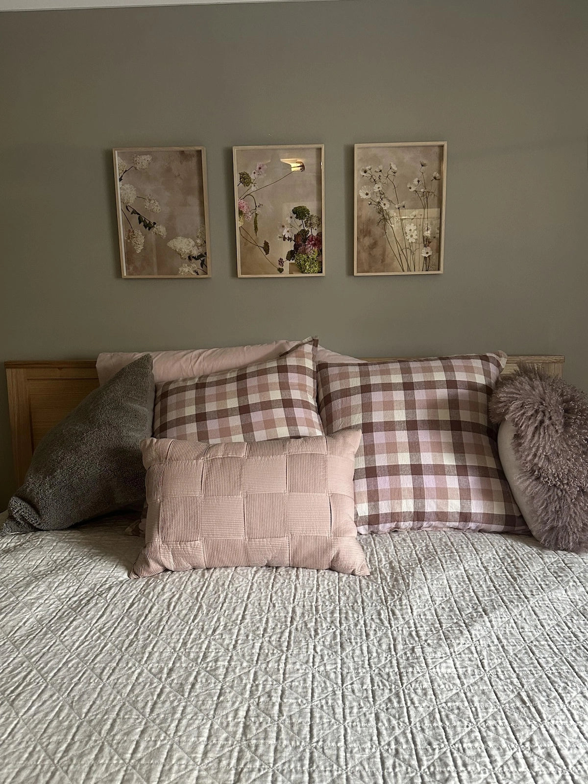
Featuring Paniculata, Summertime and Wild Cosmos