
A gallery wall should look effortless, but getting there usually isn't. Which prints go together? What sizes work? How do you keep it cohesive without making it boring?
Our gallery wall sets take the uncertainty out of the process. Each set is curated by Estée — prints selected to share a palette, mood, or visual rhythm.
Available on archival canvas or 310gsm cotton rag — in open or limited edition editions. Read more about our Australian art prints, handcrafted with care.
How Our Gallery Wall Sets Work
Curated by the artists.
We selects prints from across our collections with complementary palettes, balanced compositions to work across multiple rooms in your home or common spaces.
Flexible sizing.
Each set includes a mix of sizes designed to create visual variety. Typical sets include one hero piece (60–80cm) and 2–4 supporting prints (30–50cm).
One order, one delivery.
No hunting across multiple collections or worrying about whether prints in your print set will match when they arrive. Everything ships together.
Gallery Wall Ideas by Room
Living room gallery wall. Above a sofa is the classic gallery wall location. A set of 4–6 prints with one large centrepiece creates a focal point that's more dynamic than a single print. See our living room art.
Bedroom gallery wall. Keep it calmer — 2–4 prints in soft tones, symmetrically arranged above the bed. Fewer pieces, more breathing room. See our bedroom art.
Hallway gallery wall. Long, narrow walls suit vertical gallery arrangements. A column of 3 prints or a staggered line of 4 works well in hallway art.
Dining room gallery wall. Create a focal point above the dining table with 3–5 prints in a cohesive arrangement. See our dining room art.
Staircase gallery wall. Follow the line of the staircase with prints ascending in a diagonal. This is one of the most satisfying gallery wall placements when done well.
Pairing by shared colour palette
Note: We are using A1 sizes in all our examples for simplicity
Pairing two different pieces of artwork using the same colour palette is one of the easiest ways to create a visually cohesive and harmonious display.
Even if the artworks differ in style, subject matter, or medium, a consistent colour scheme can make them feel naturally connected.
Examples of effective pairings of shared colour palette:
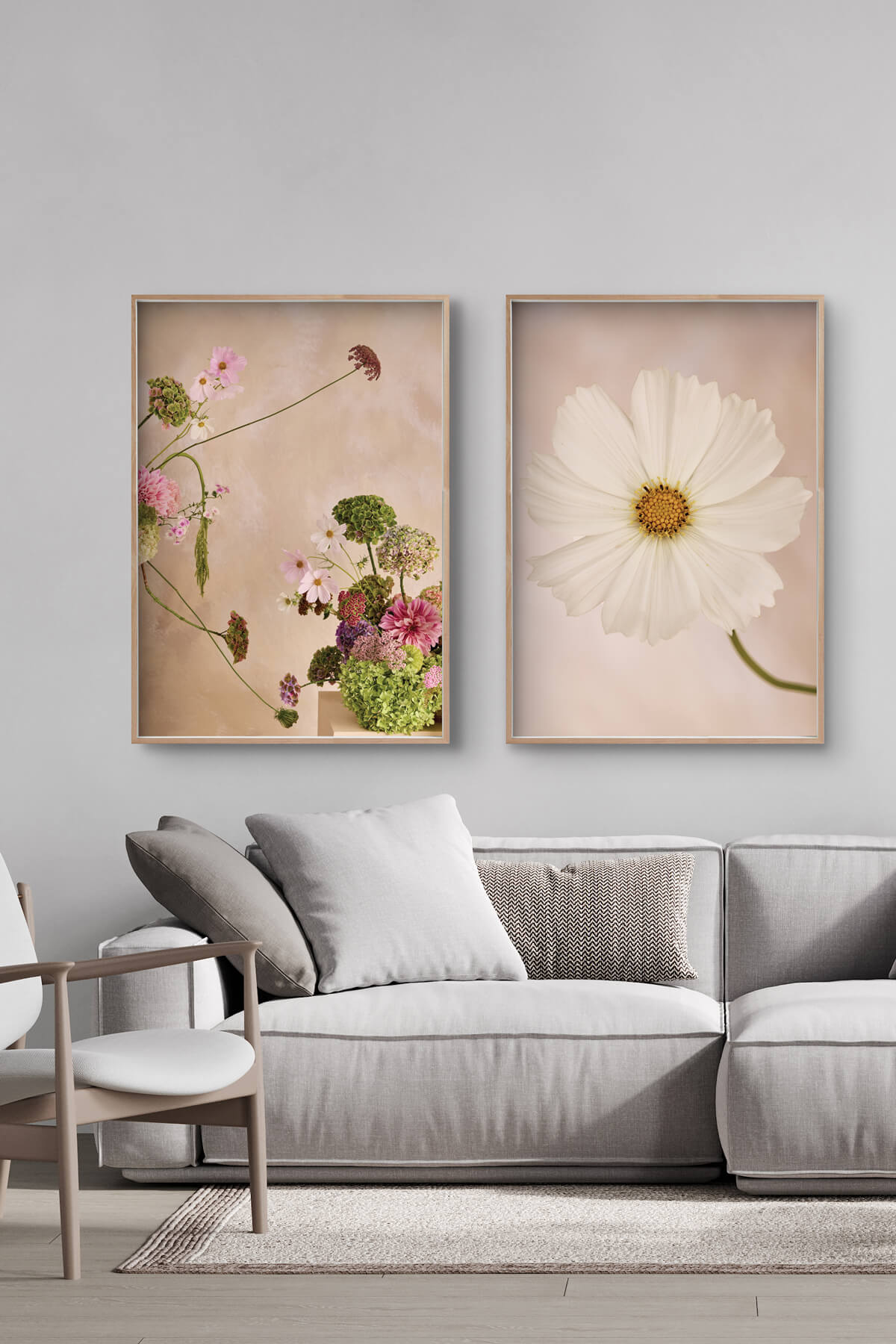
1
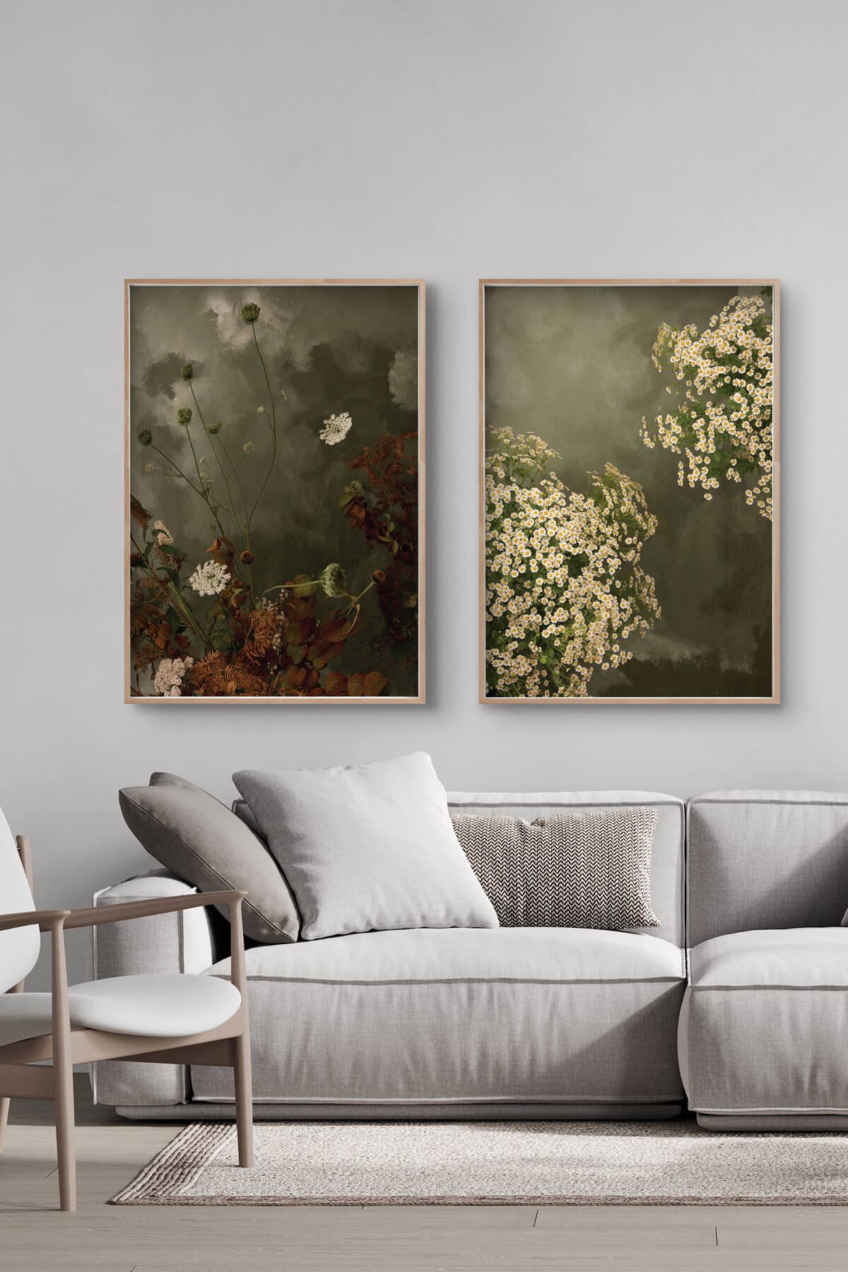
2
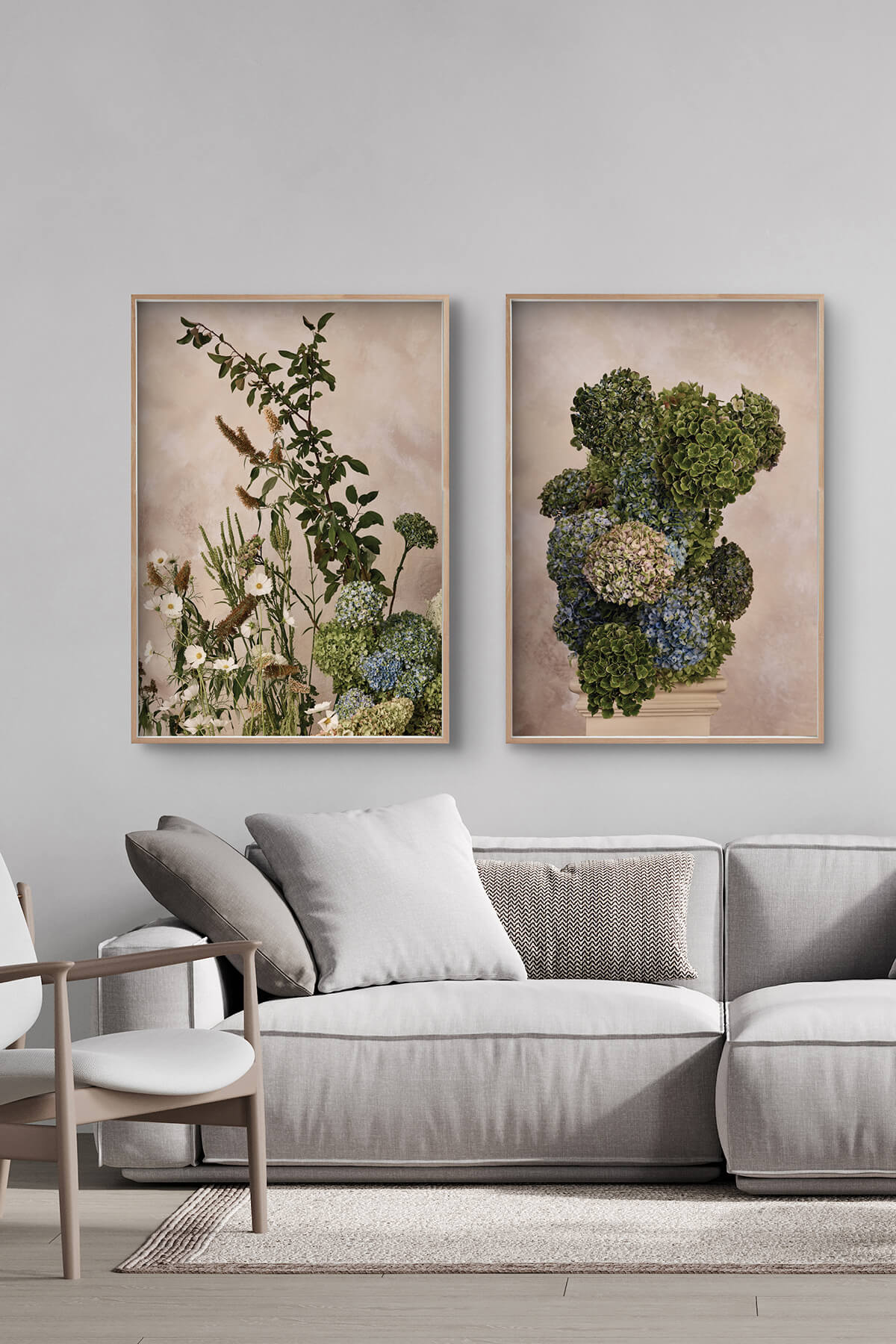
3
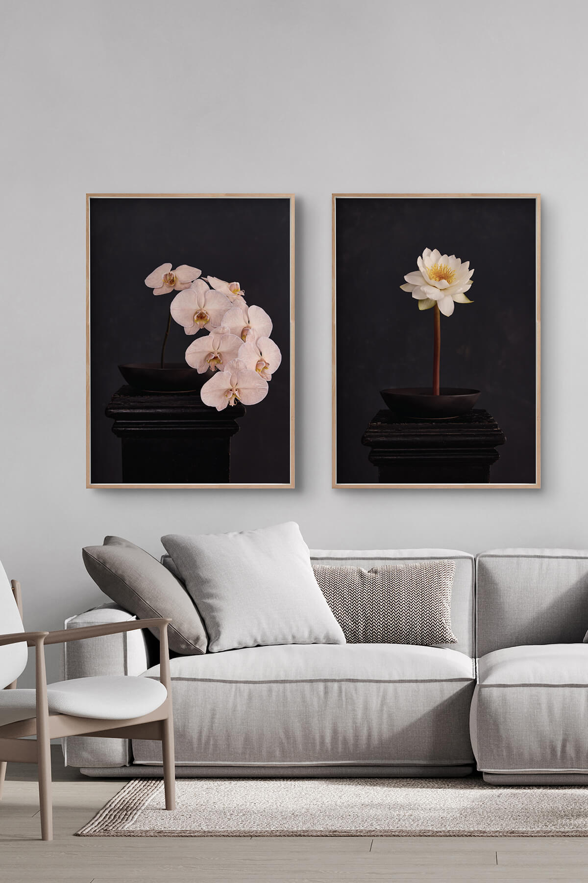
4
Build Your Own Gallery Wall
Don't see a pre-curated set that fits? Build your own from any of our collections. Here are some starting points:
All botanicals: Mix hydrangea prints, peony prints, and wildflower prints for a lush, garden-inspired wall. Add a large format prints as your hero piece.
Mixed subjects: Combine a floral, a still life, and a landscape for variety within a shared moody palette
Seasonal mix: Pair warm-toned prints (ambers, rusts) with cool-toned pieces (blues, greens) for year-round balance
Tonal harmony: Choose 3–5 prints in the same colour family but different subjects
Pairing abstract with abstract
Pairing two abstract pieces can really amp up the visual impact of a space. The trick is striking the right balance between cohesion and contrast.
That doesn’t mean they need to have the same colours; mixing things up can actually make the display more bold and interesting. The key is finding other ways to tie them together, like similar composition, movement, texture, or contrast.
It’s all about creating a connection without making them look too similar.
Examples of effective pairings of abstract pieces:
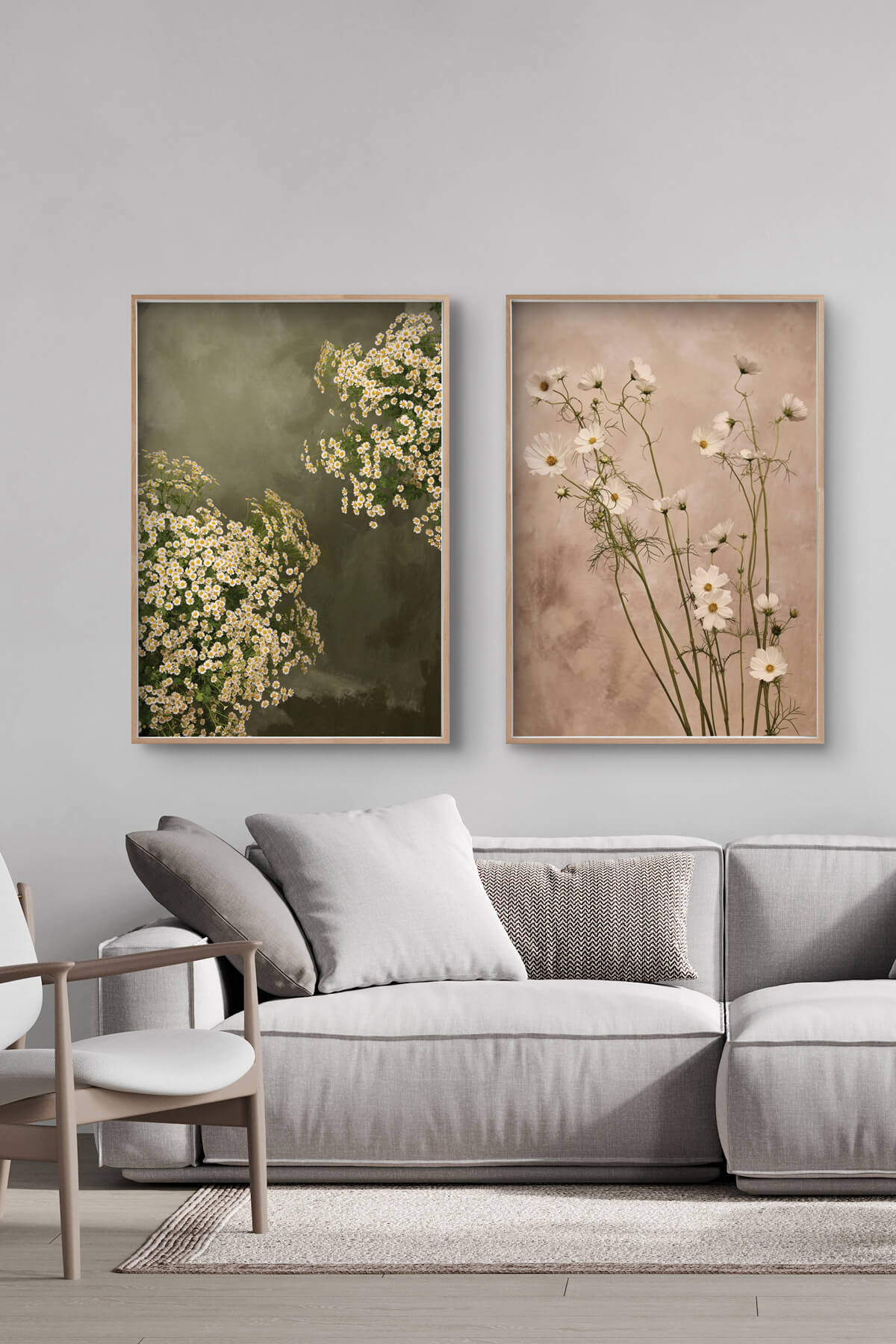
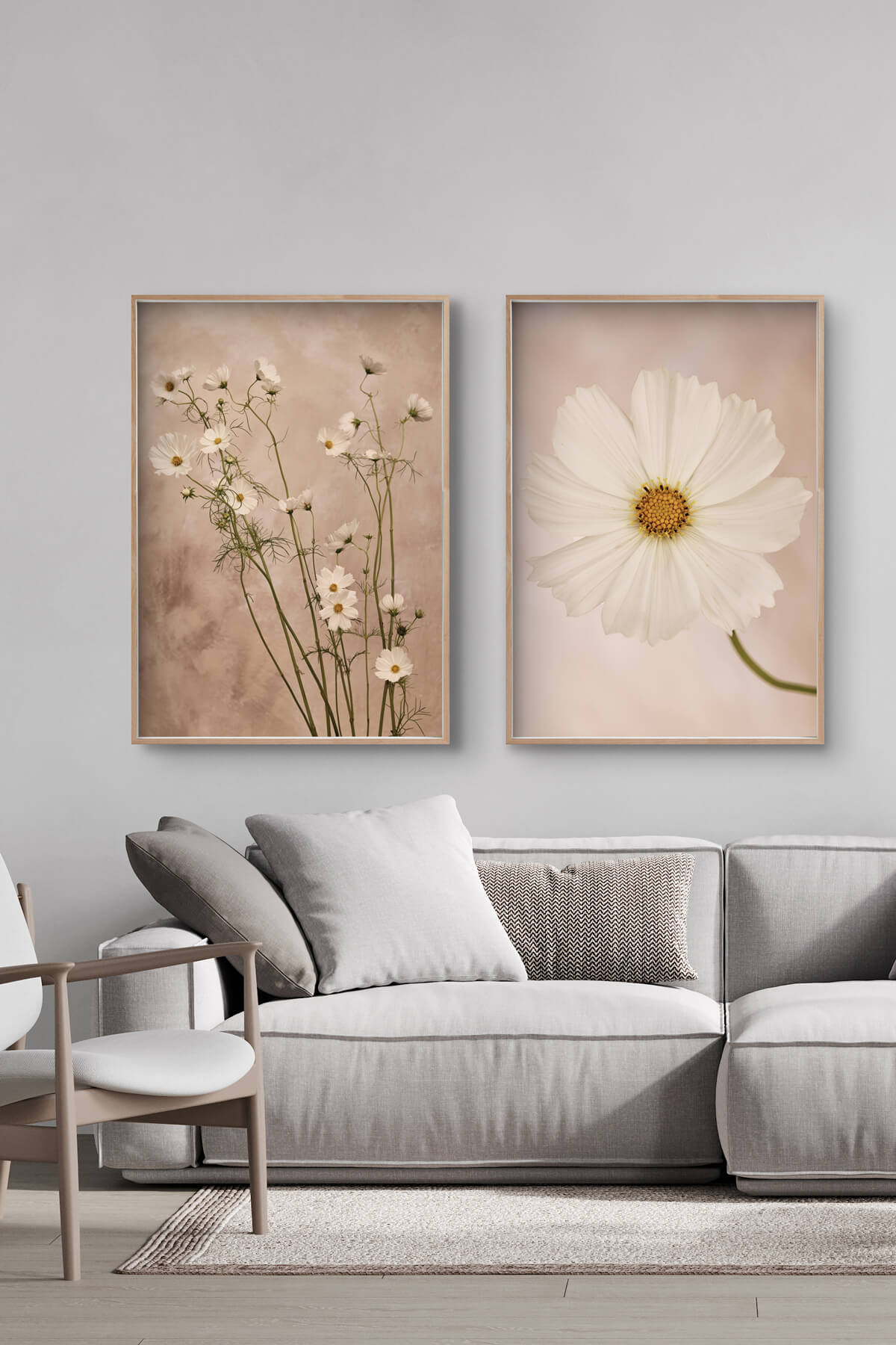
- Chamomile and Wild Cosmos
- Wild Cosmos and Cosmos
- Bracken and Chamomile
1
3
2
Pairing abstract with still life
Note: 'Still life' refers to artwork depicting objects arranged on a plinth.
Pairing abstract art with still life can create a strikingly balanced and visually dynamic display. The contrast between the structured, recognisable elements of still life and the fluid, expressive nature of abstract art adds depth and intrigue to any space.
The key is to find a common thread between the two, ensuring they feel connected rather than mismatched.
Examples of effective pairings of abstract and still life
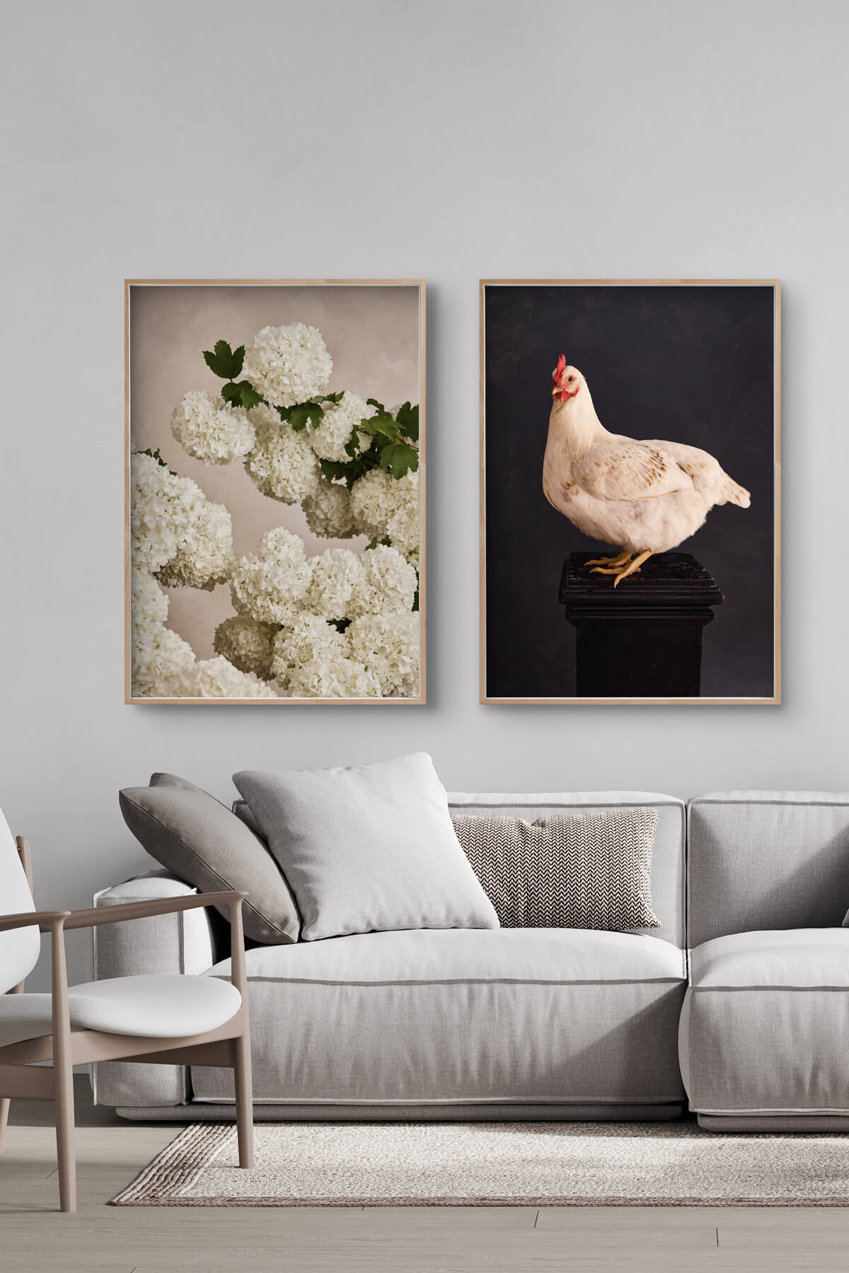
- Rose and Garden State
- Garden State and Architect Hydrangea
- Featuring Snowball and Rose

1
2
3
Materials & Archival Quality
Every print in our gallery wall sets is produced on museum-grade archival materials. Choose satin-finish canvas (ready to hang) or 310gsm cotton rag (for custom framing). Both use inks rated for 75+ years.
FOR A FREE DESIGN CONSULTATION AND QUOTE, CONTACT US TODAY
Have a question, confused about what size is best, not sure which medium works? Let us help you. In-home visits available for South Australian customers. No obligations.
Frequently Asked Questions
We'd recommend sticking to one substrate for a cohesive look. Canvas prints have a satin texture; cotton rag is smooth matte. Mixing them can create a visual inconsistency, especially in a grouped arrangement.
Three is the minimum for a gallery wall to feel intentional rather than accidental. Five to seven is the sweet spot for most walls. More than nine starts to feel busy unless you have a very large wall.
Canvas prints arrive ready to hang. Cotton rag prints are unframed — we recommend having them custom framed with a consistent frame style across the set for a unified look.
Yes — all prints in our gallery wall sets are also available individually. The sets simply offer a curated selection and layout suggestion.