
Du Calme Introduction
Du Calme is Austin Bloom's French-inspired collection — fine art prints that draw on the tradition of hand-painted interiors, floor-to-ceiling wallpapers, and the quiet beauty of French provincial spaces. The name translates loosely as "calm" or "stillness," and that is exactly what this collection is designed to carry into a room.
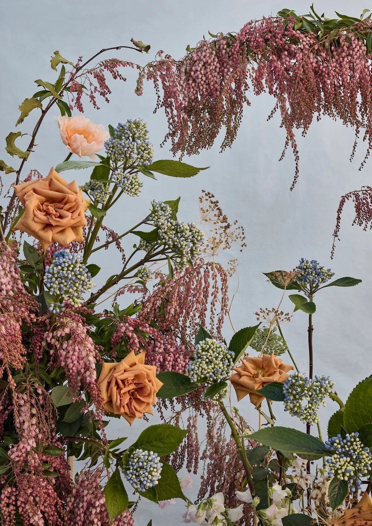
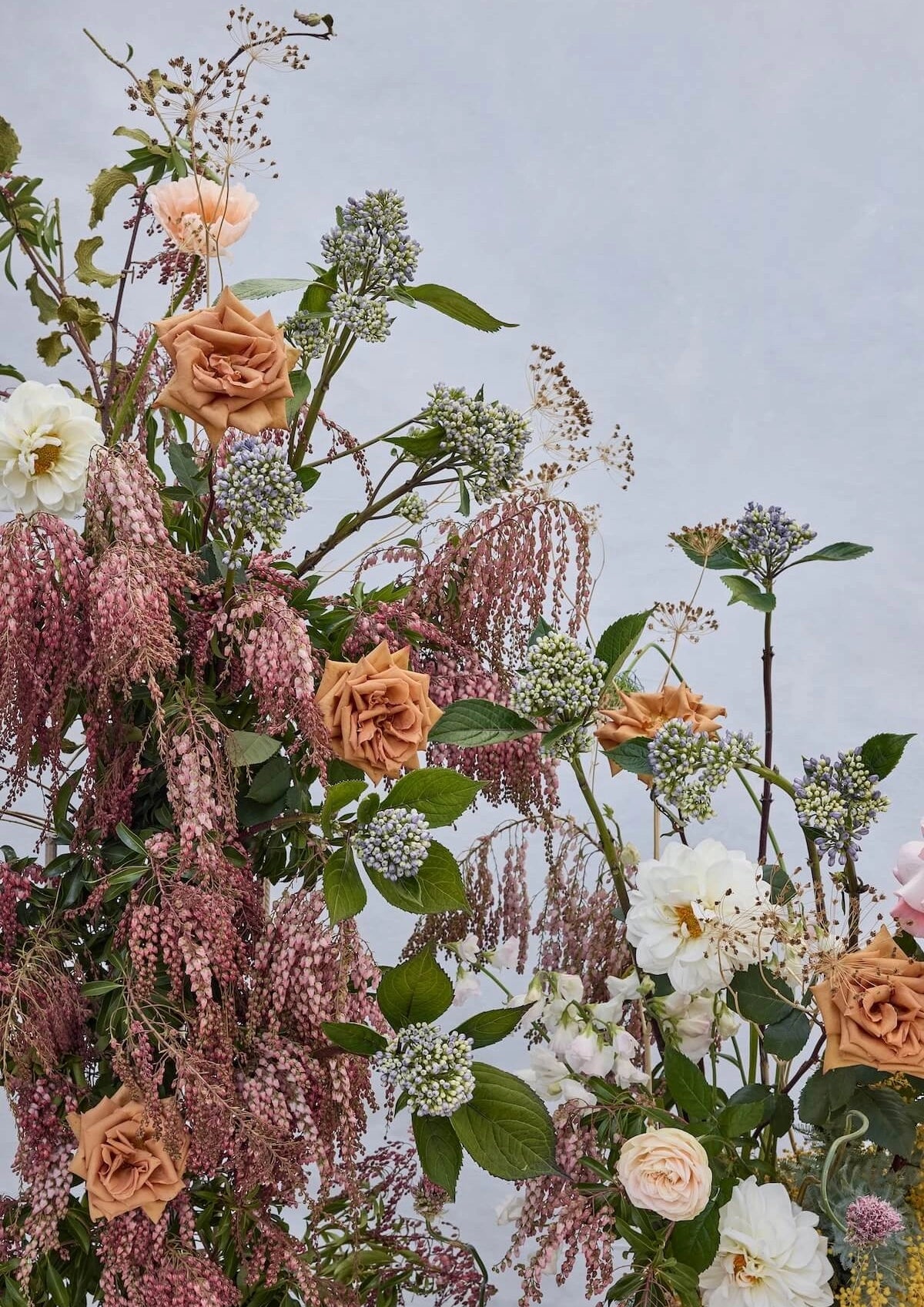
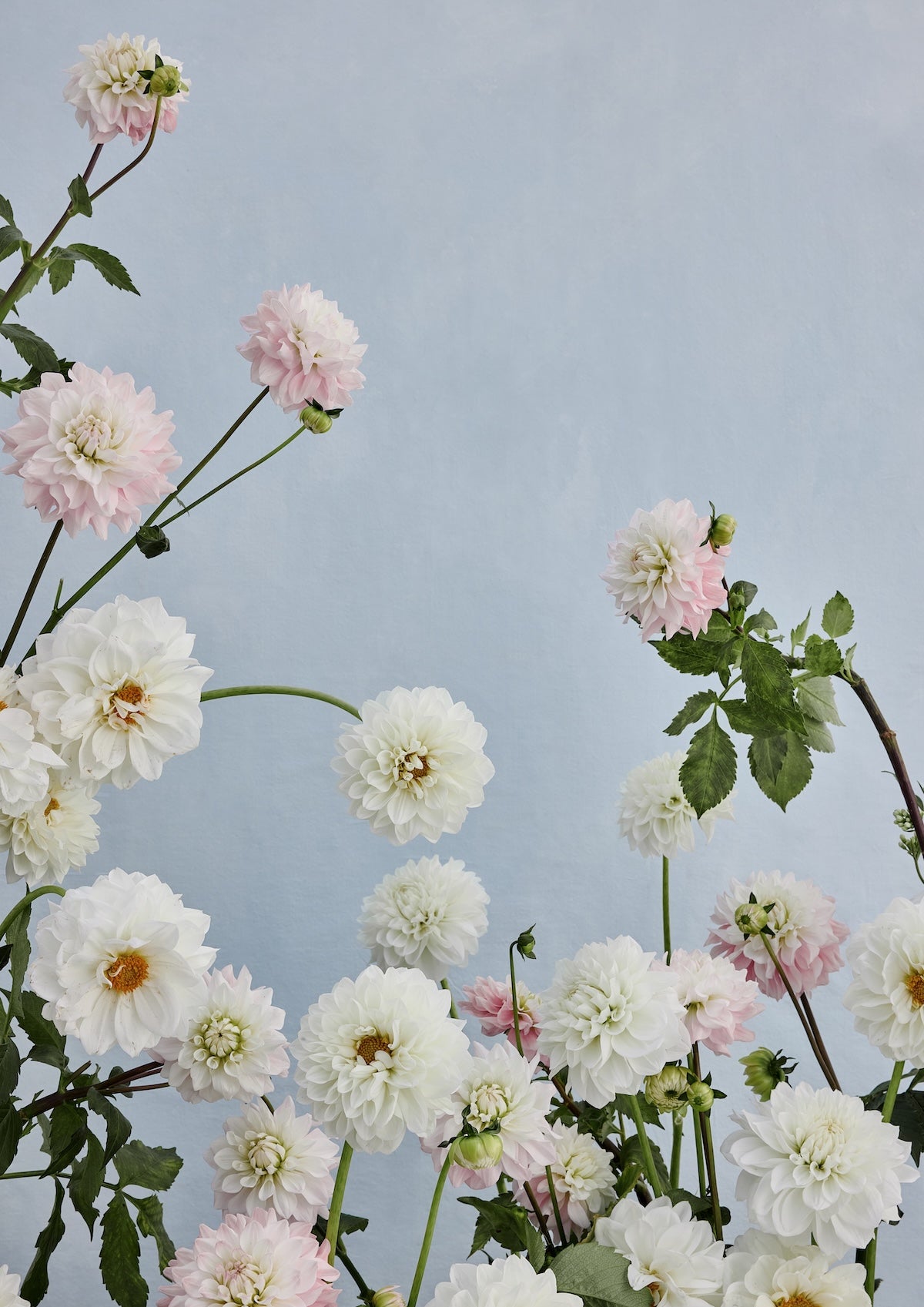
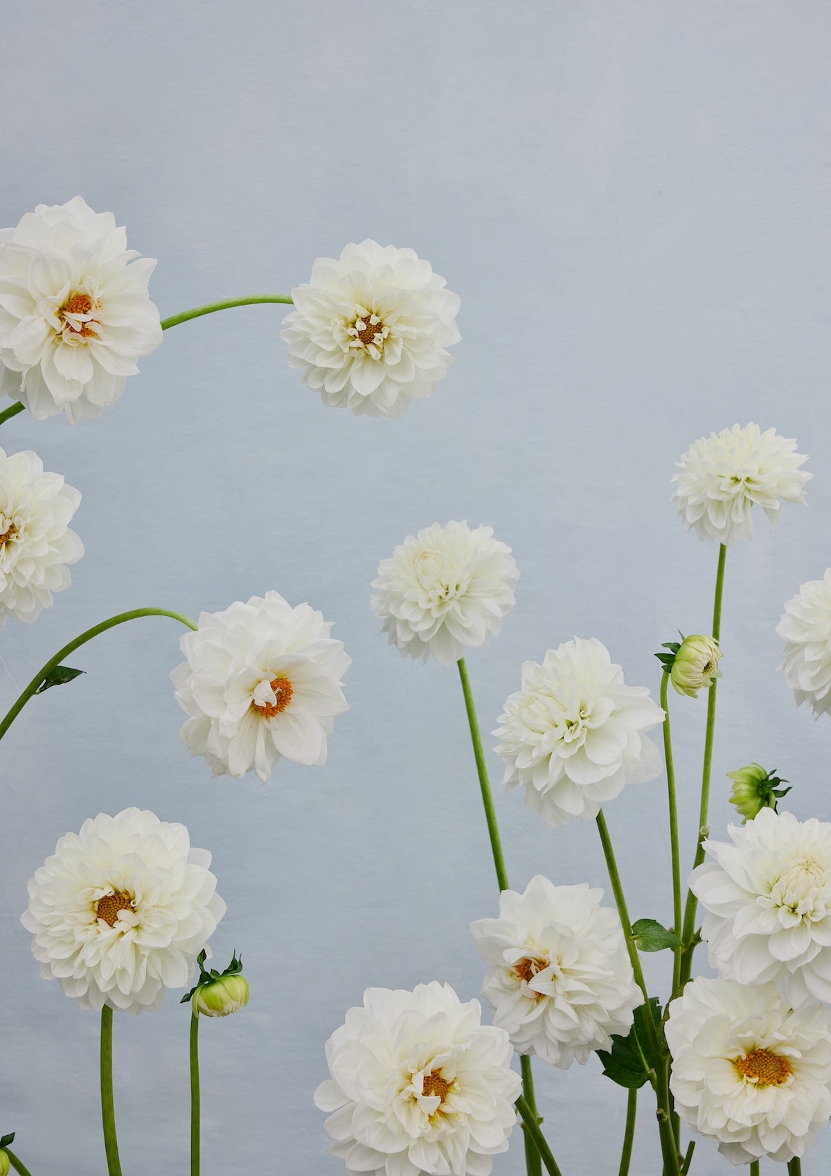
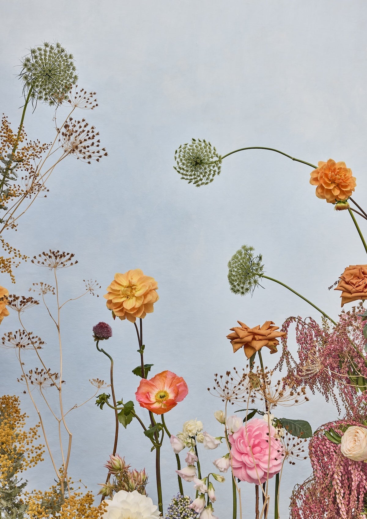
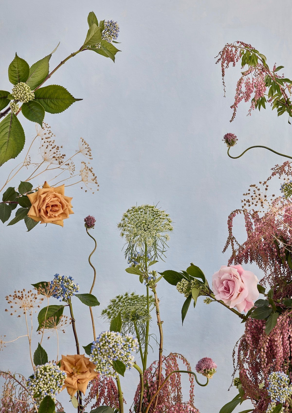
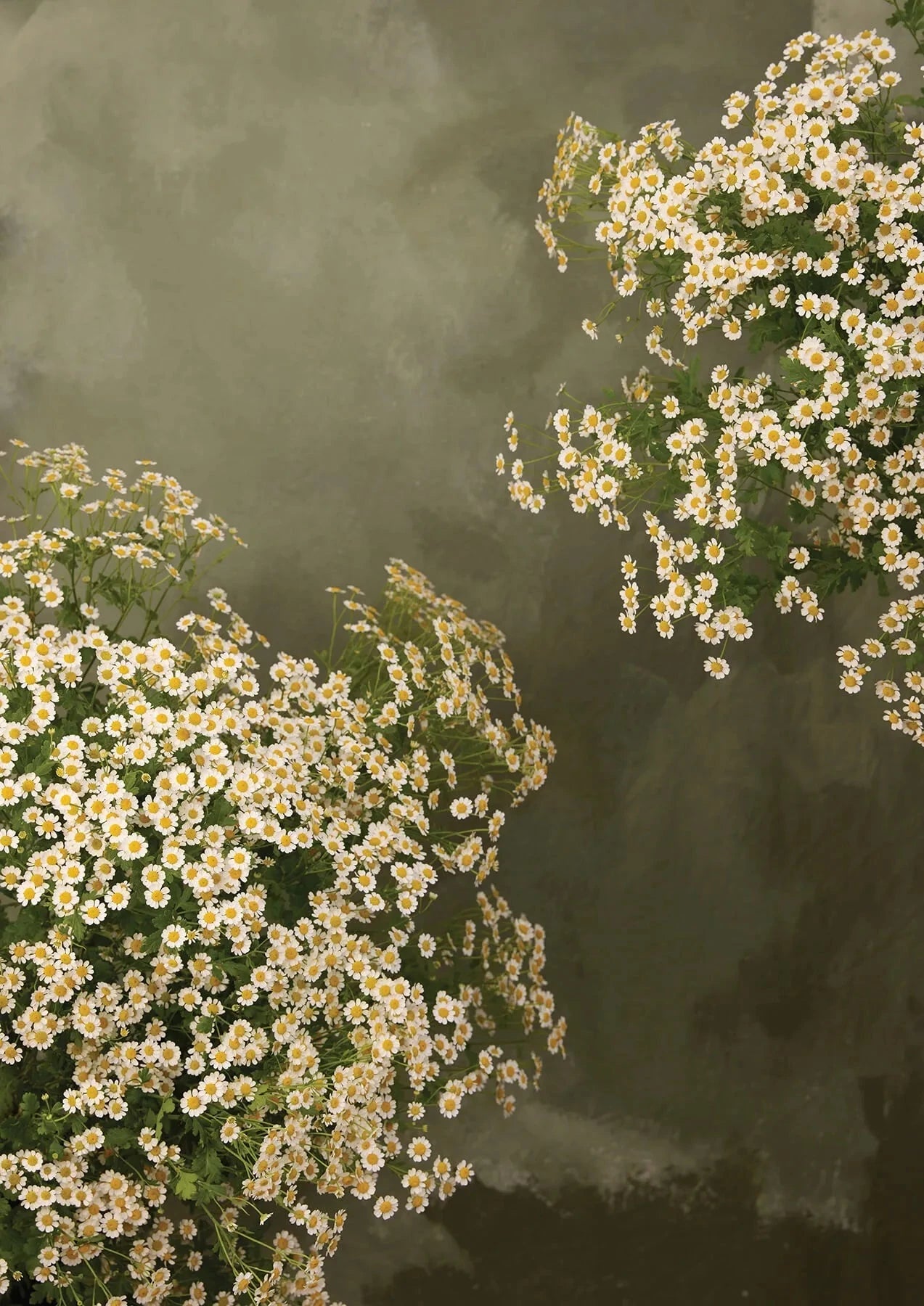
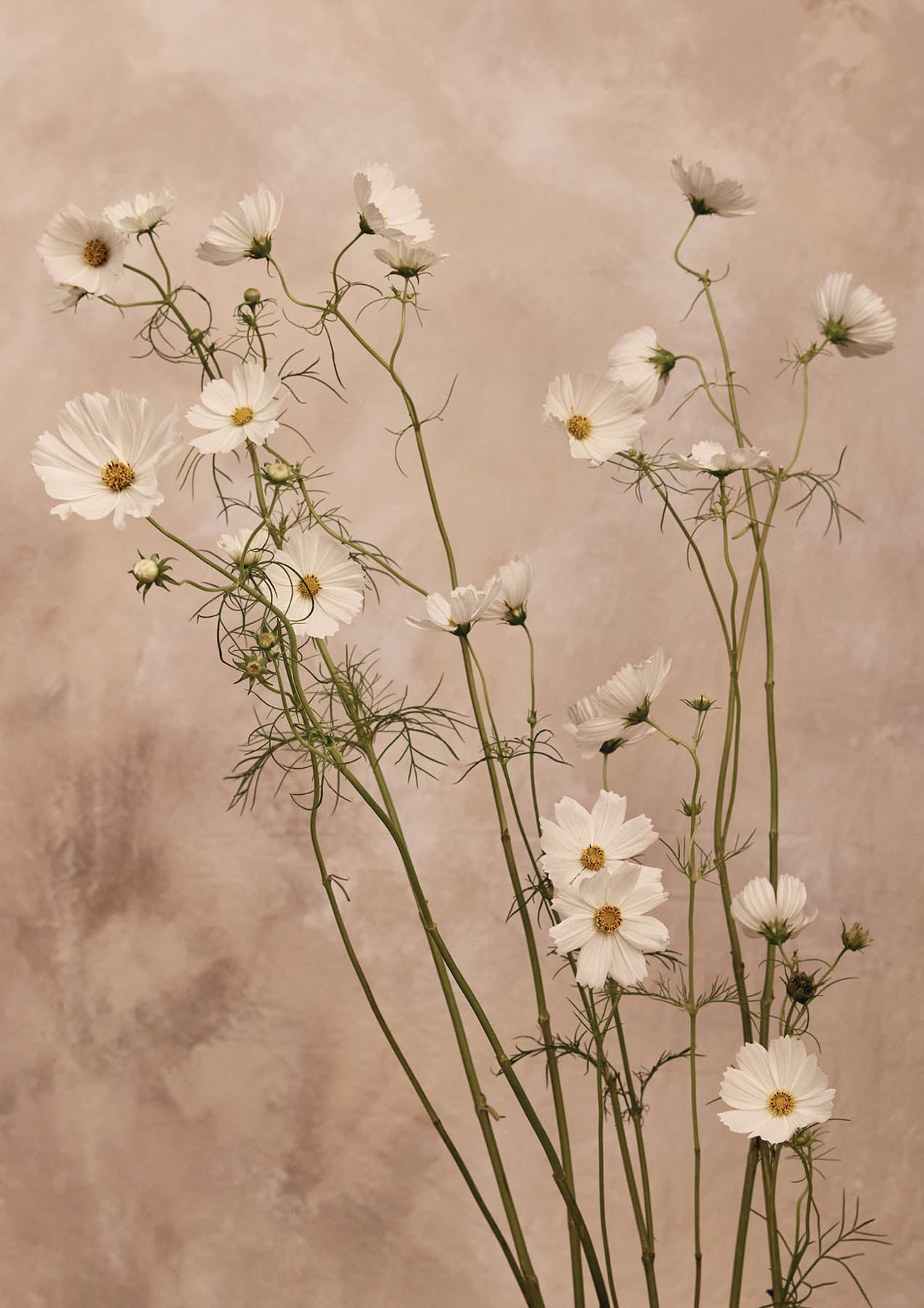
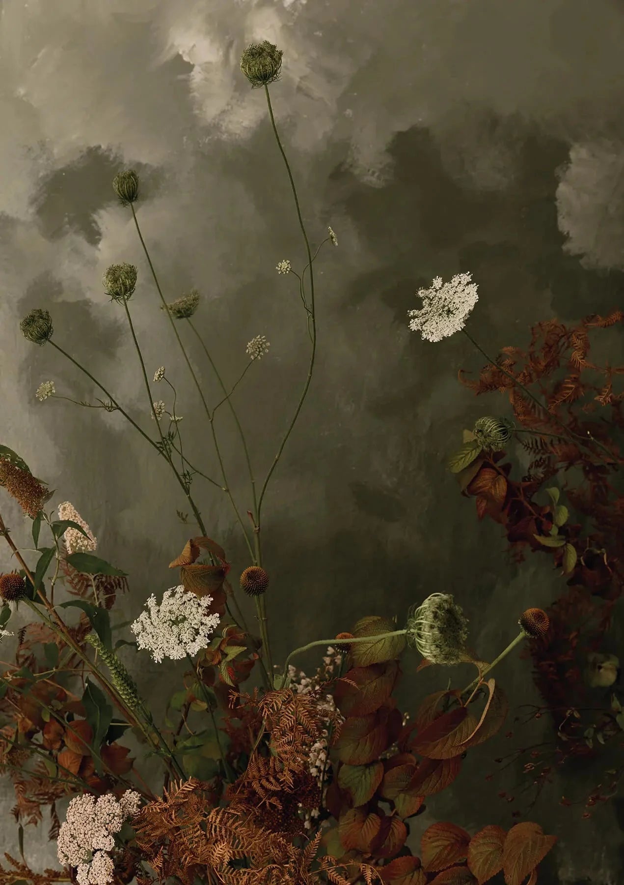
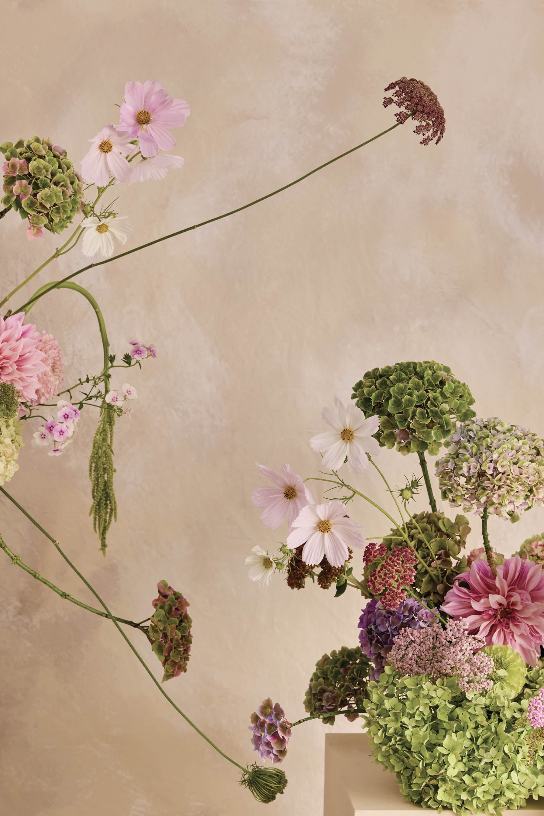
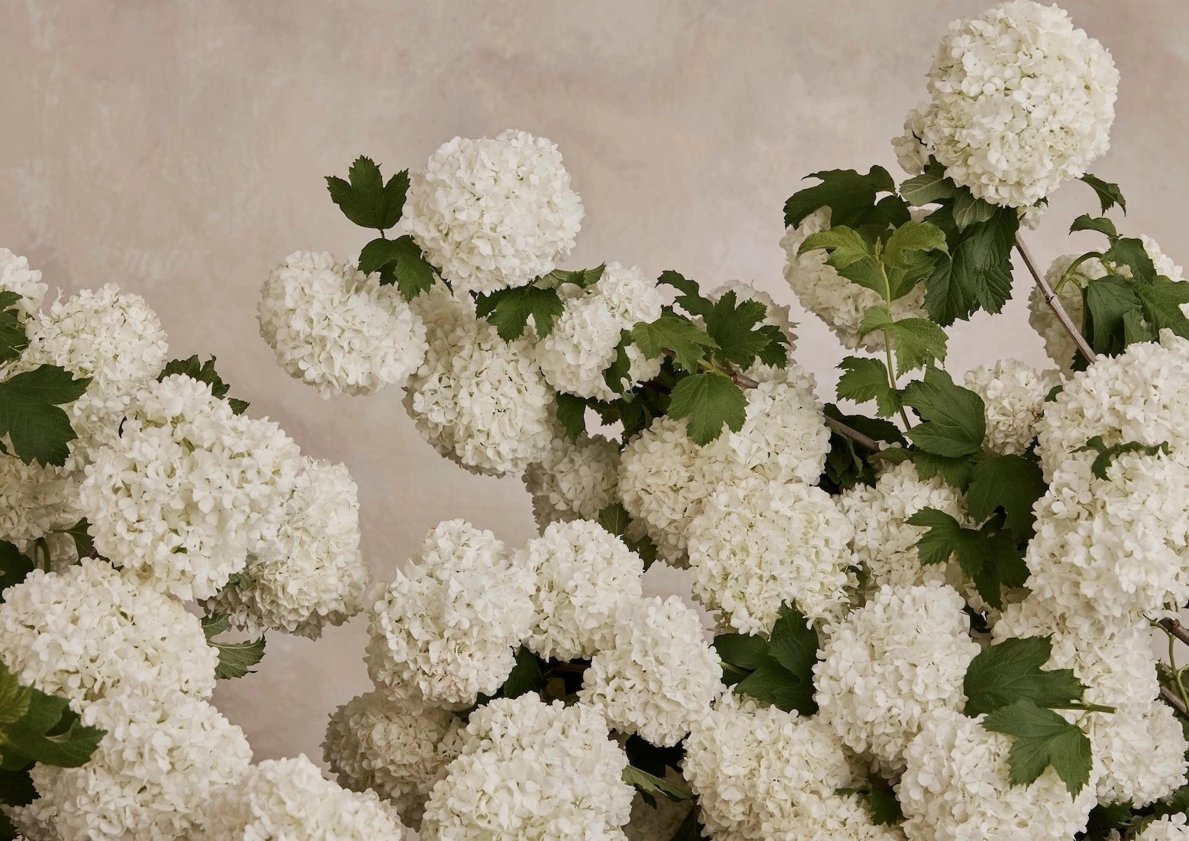
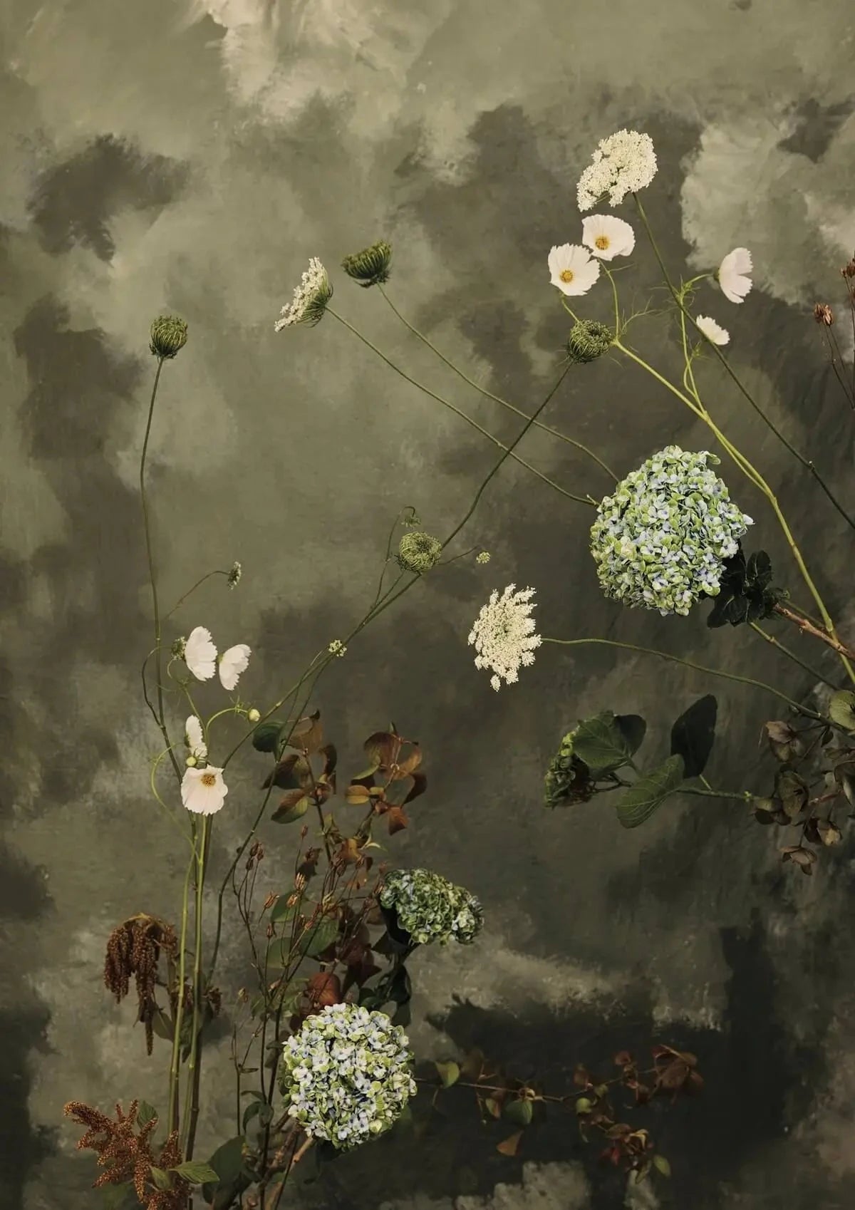
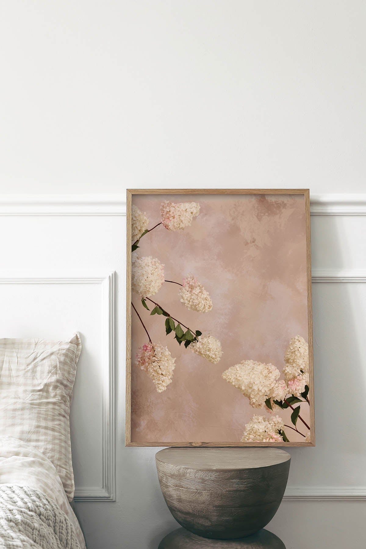
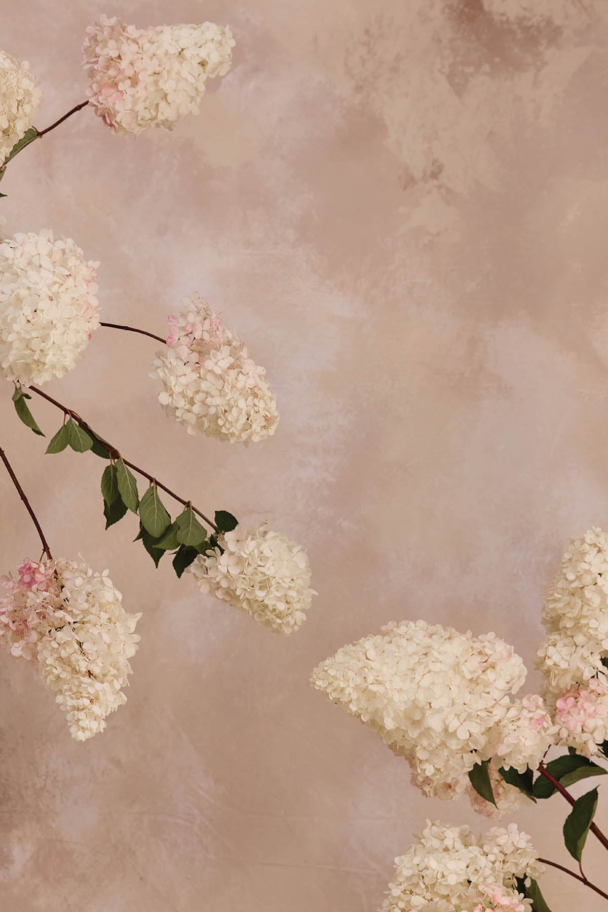
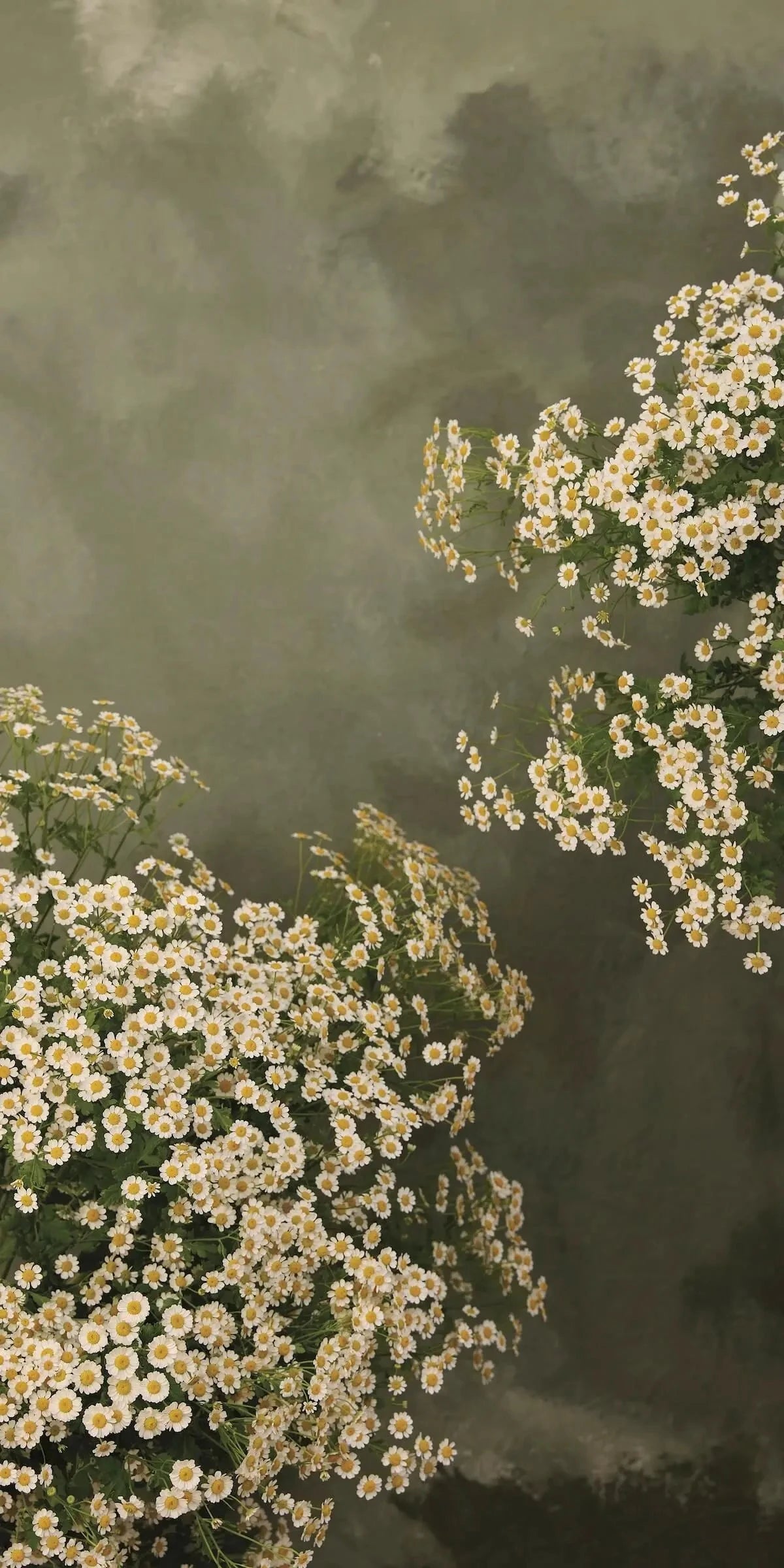
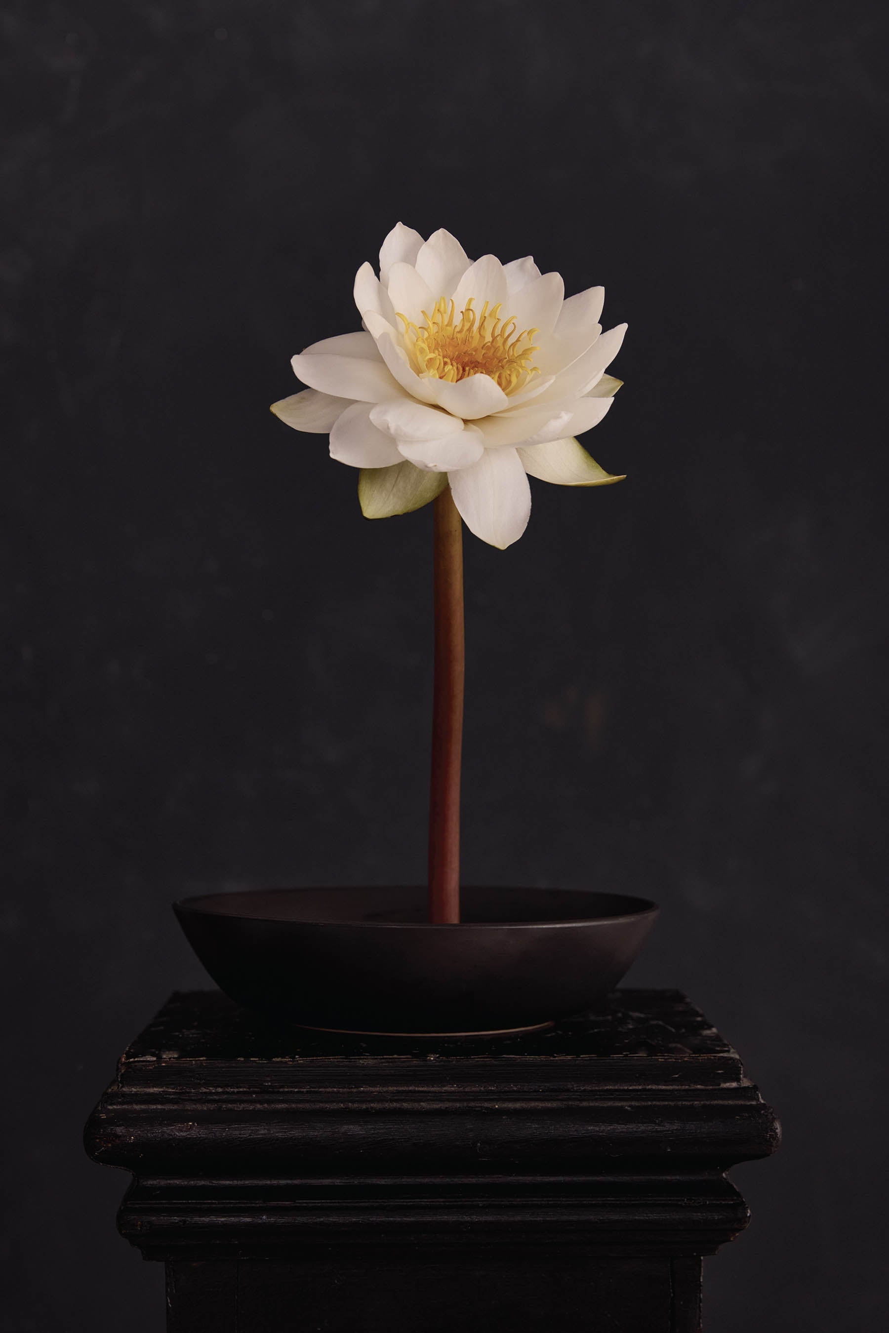
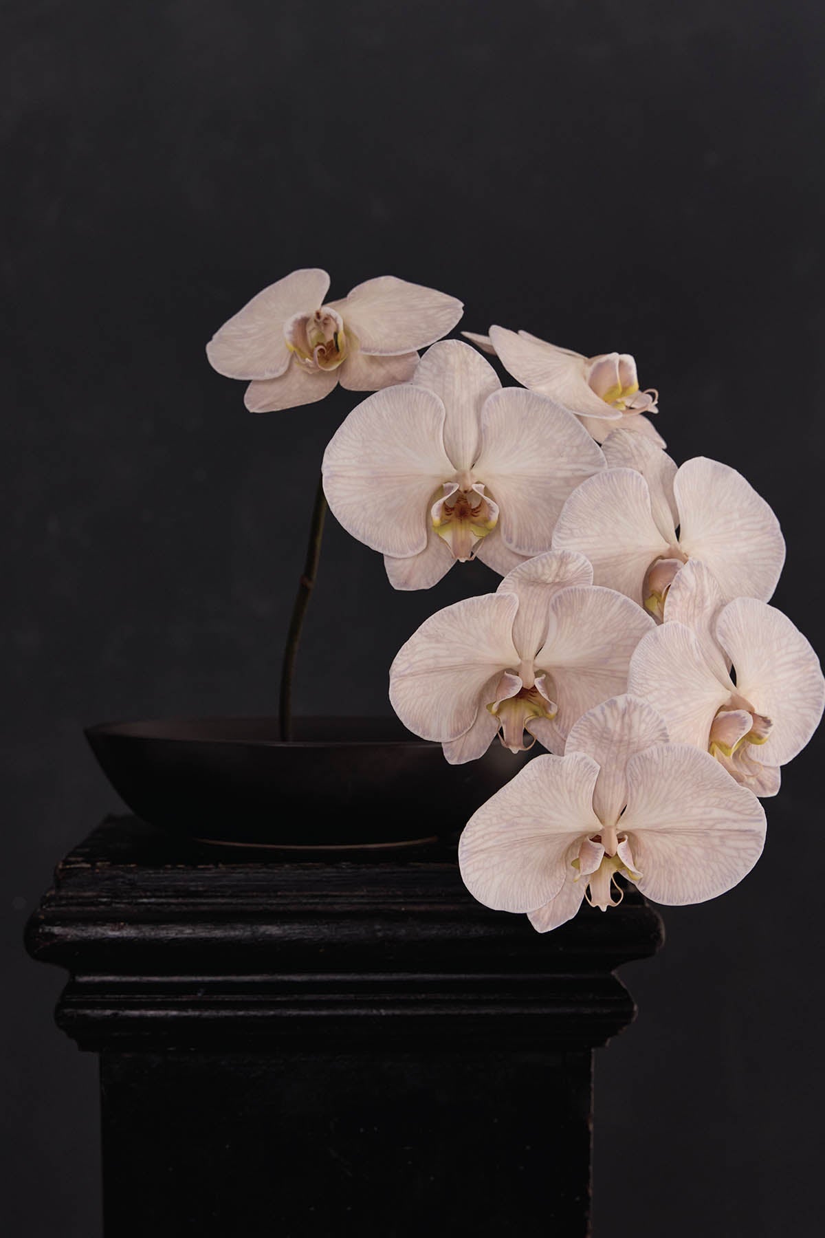
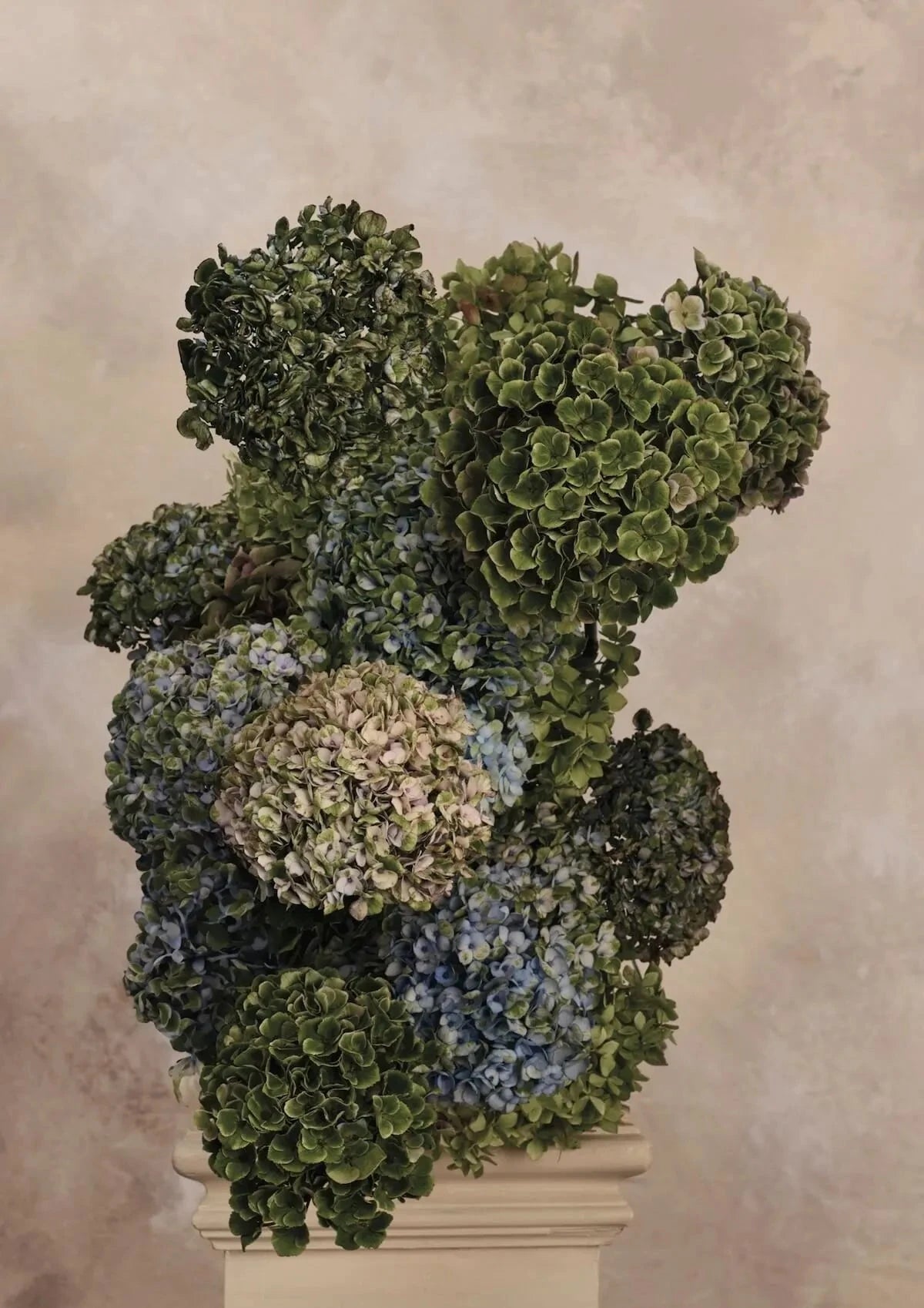
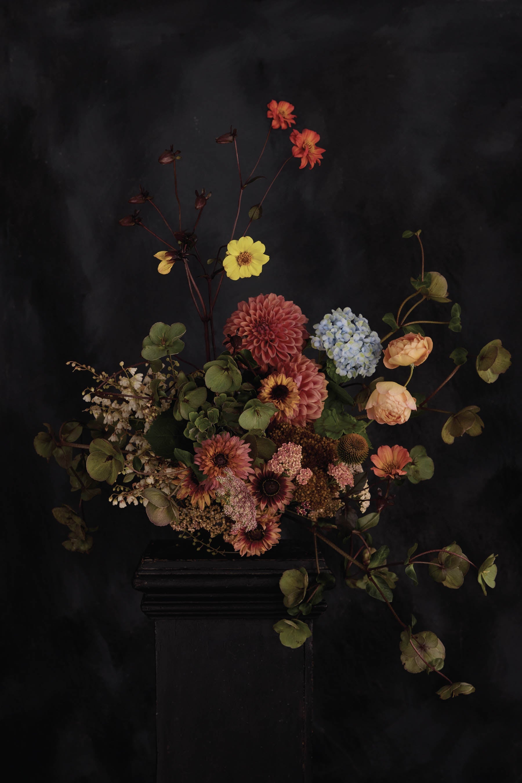
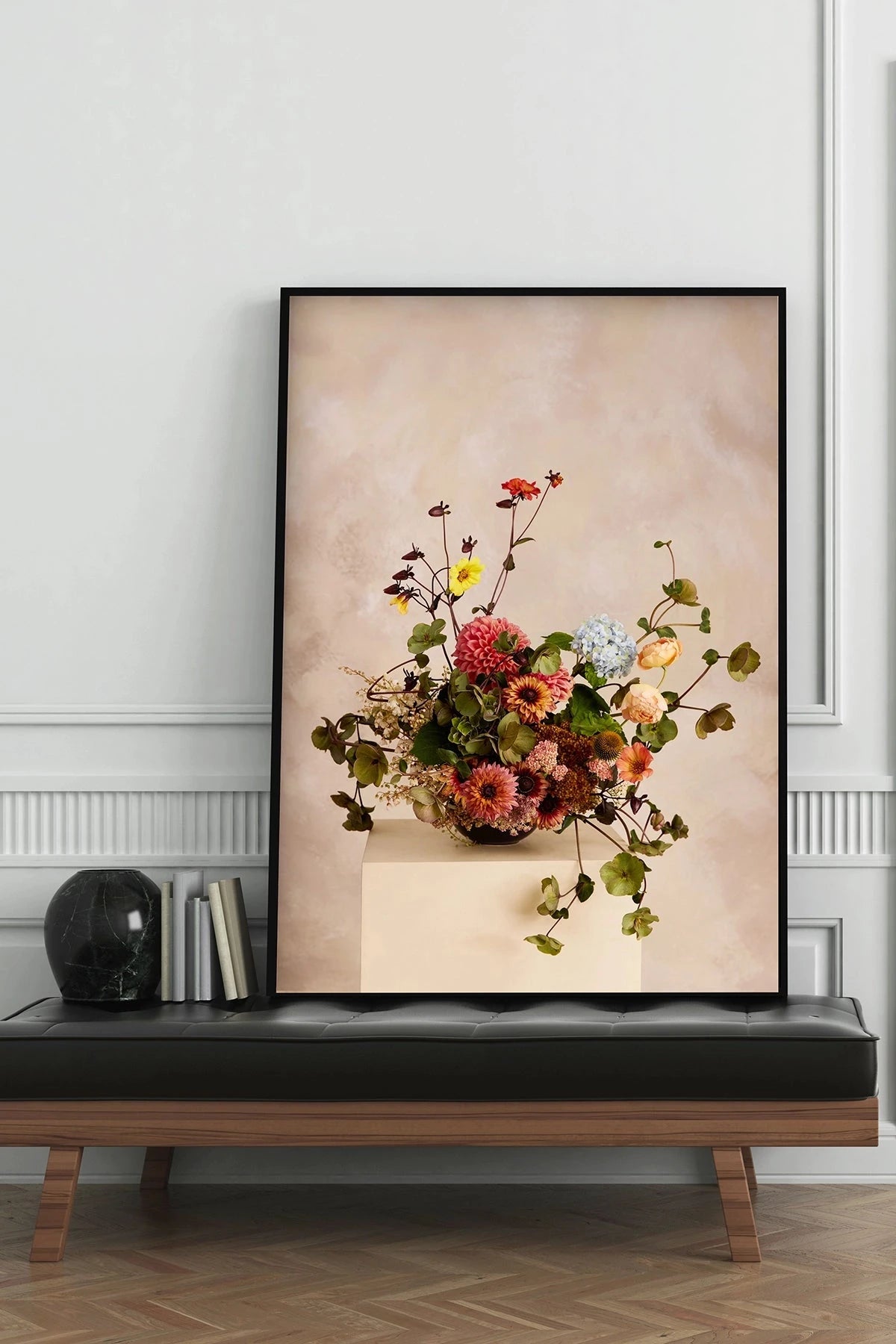
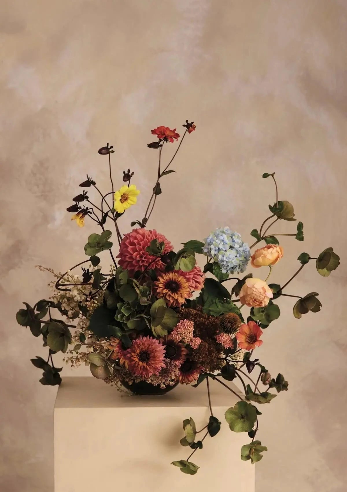
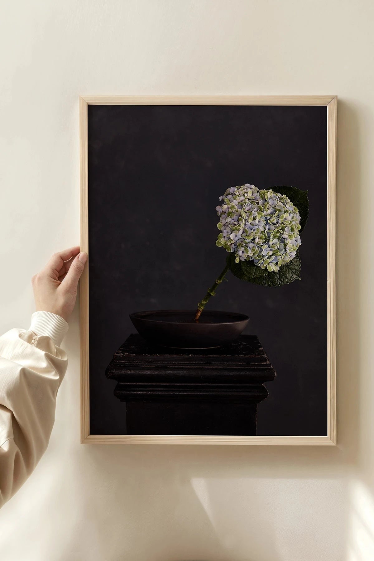
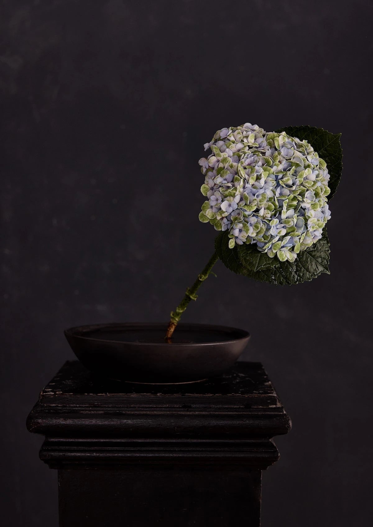
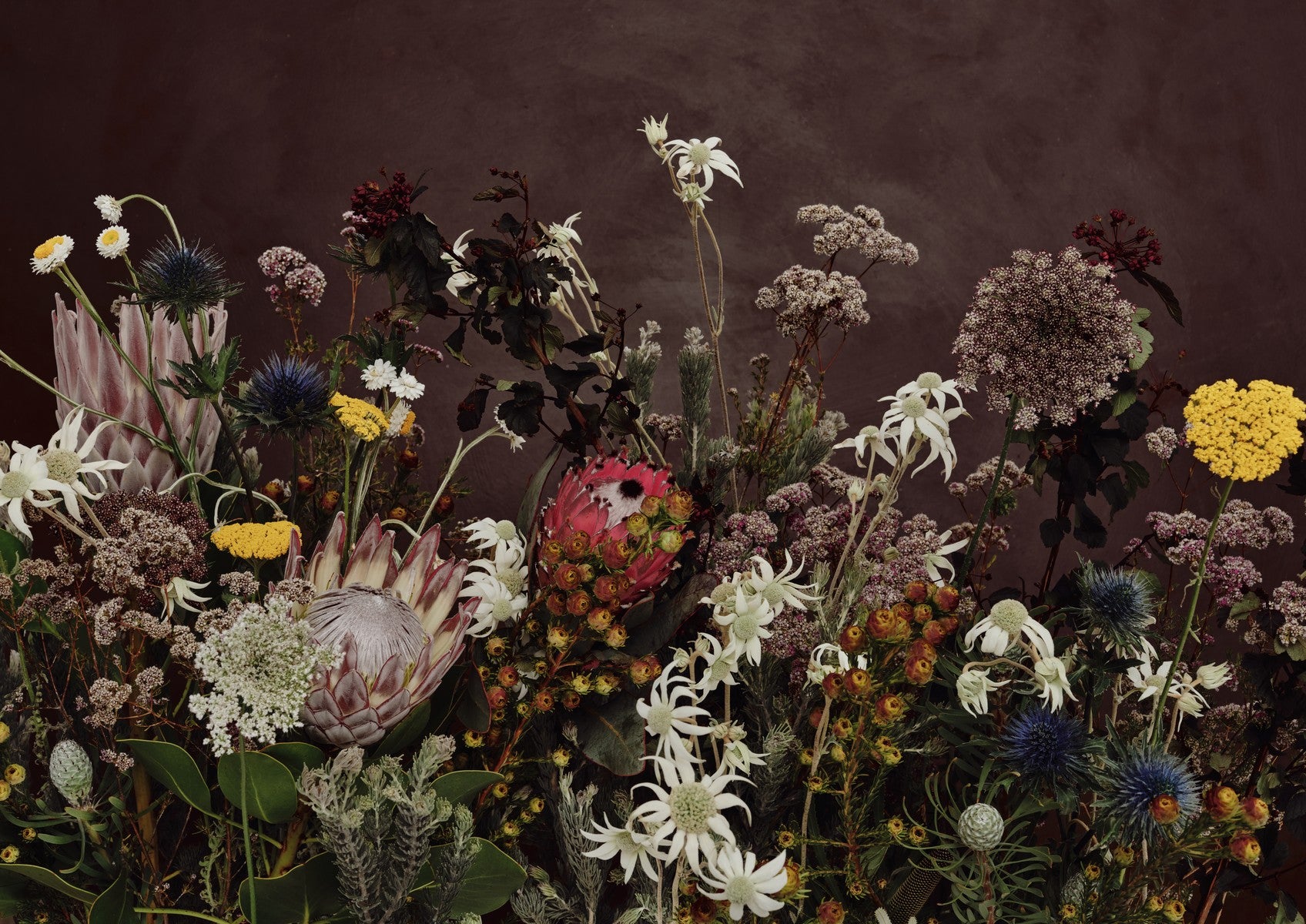
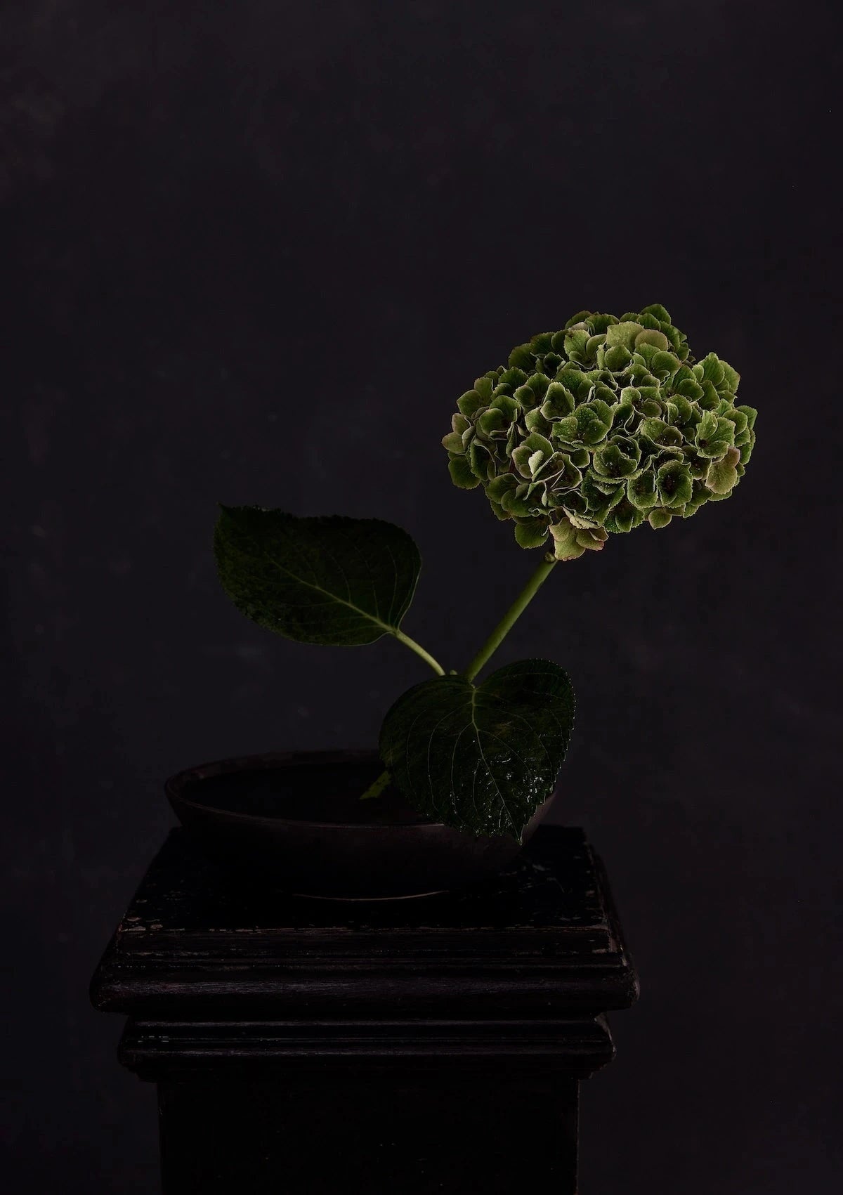
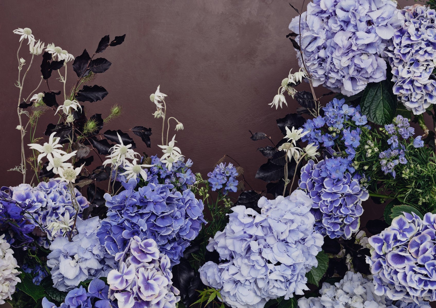
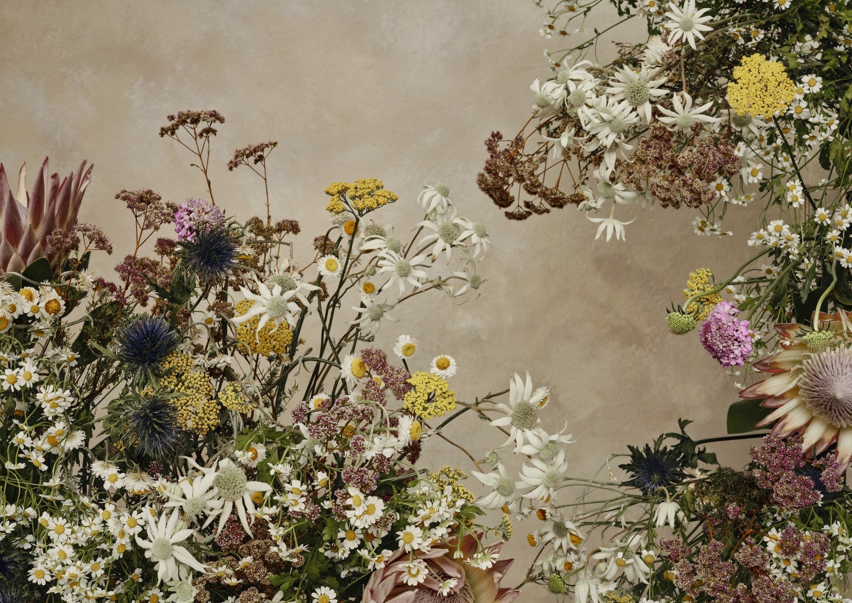
Each piece began with a hand-painted backdrop. Estée tested dozens of blues before settling on a dusty, heritage tone — warm enough to feel inviting rather than cold, with a quality that shifts through the day: quieter in the morning, richer by evening light. Florals were then layered over this background, building depth the way a painter would add to a canvas.
The result sits somewhere between photography and painting. Familiar French landmarks — Versailles, Giverny, the Palais Garnier — reimagined through a botanical lens, with compositions that feel as considered as the interiors that inspired them. An Australian artist, Australian printers.
Filters


The Collection
The collection shares a unifying palette — that distinctive dusty blue — while each piece carries its own character.
Palais Garnier:
The grandeur of the Paris opera house, reinterpreted through floral composition.
Jardin du Luxembourg:
A French bouquet arrangement that references the formal gardens of the Left Bank.
Palace of Versailles:
Scale and symmetry drawn from the most recognisable interiors in the world.
Saint-Chapelle:
Gothic light and colour — the stained glass translated into botanical form.
Montmartre:
The artistic quarter's energy captured in a more intimate, textured composition.
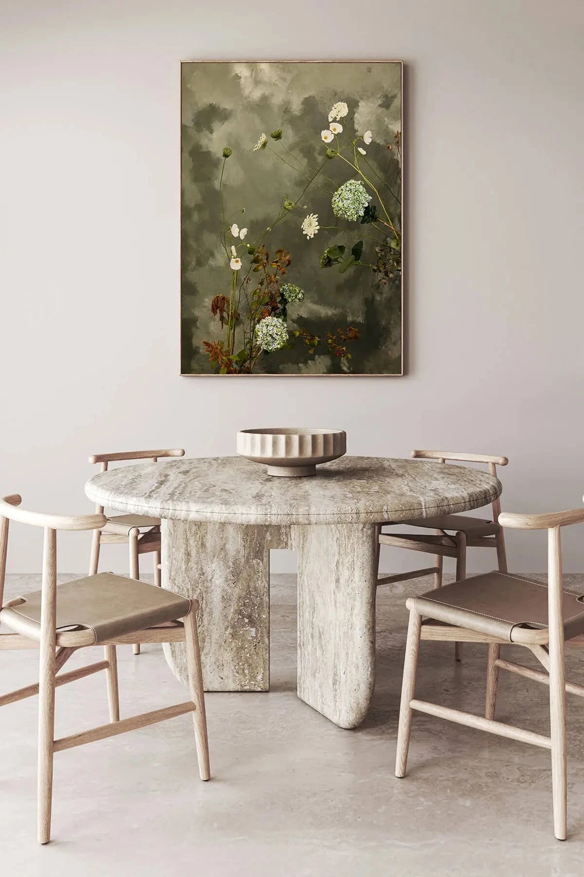
Monet's Garden — Giverny:
Where this collection feels closest to its roots. Water, light, flowers, stillness.
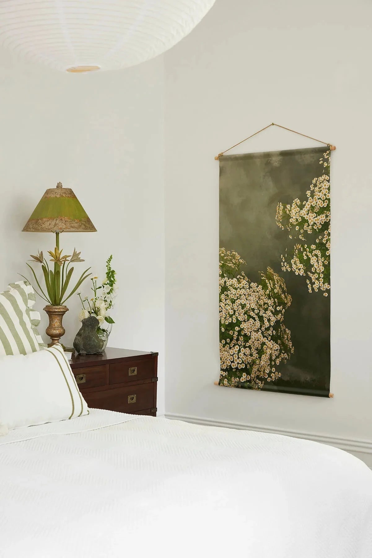
Where to Hang French Art Prints
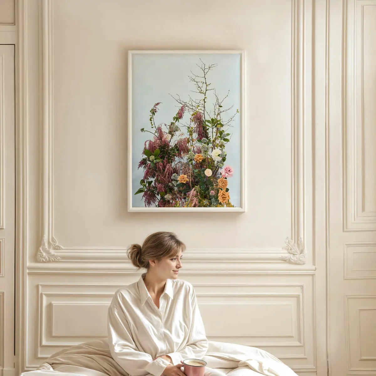
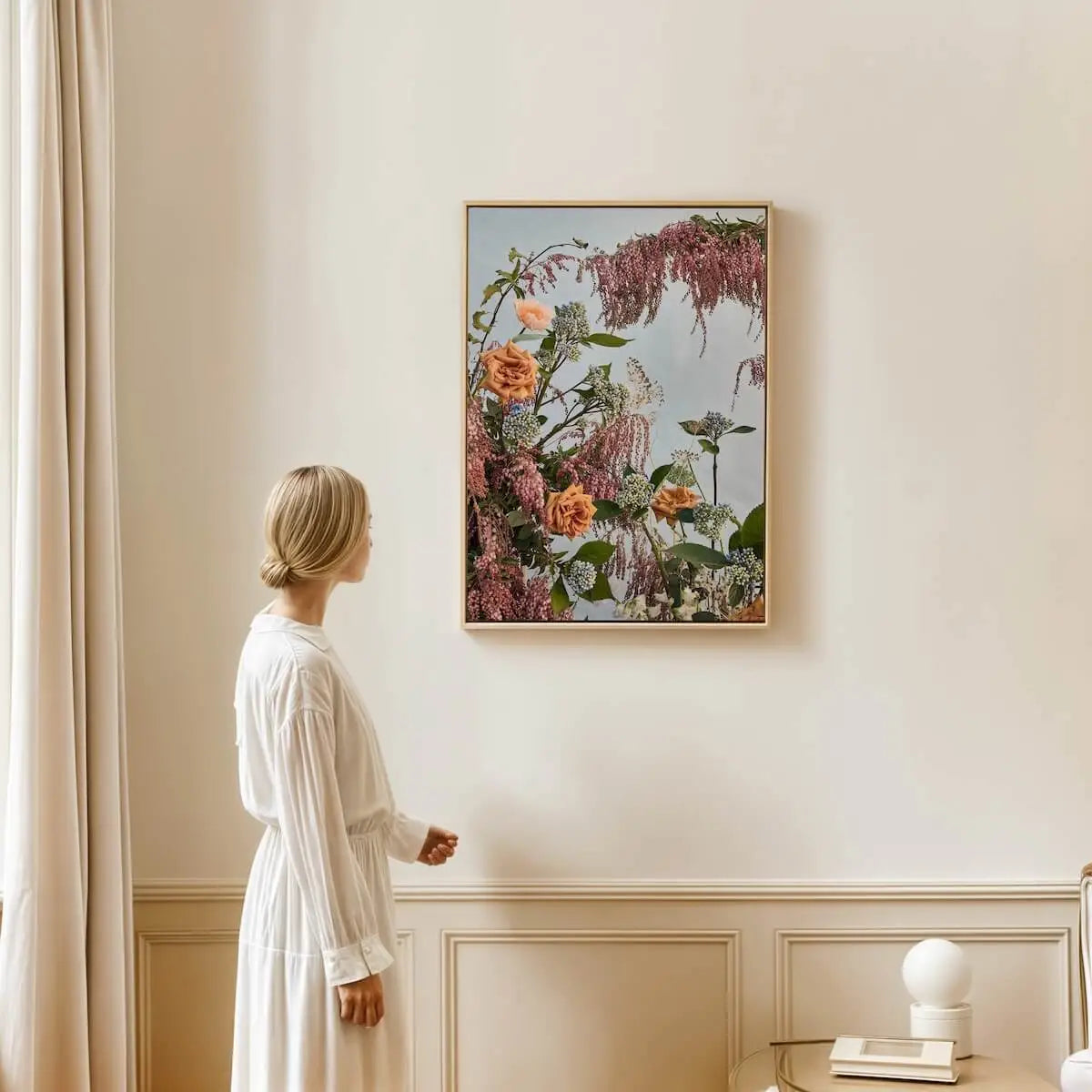
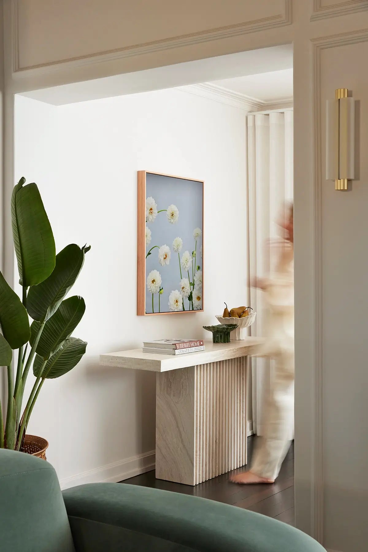
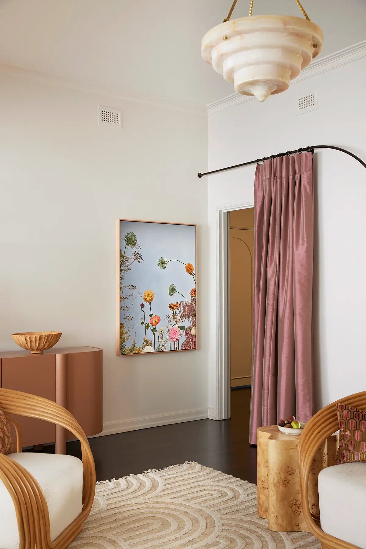
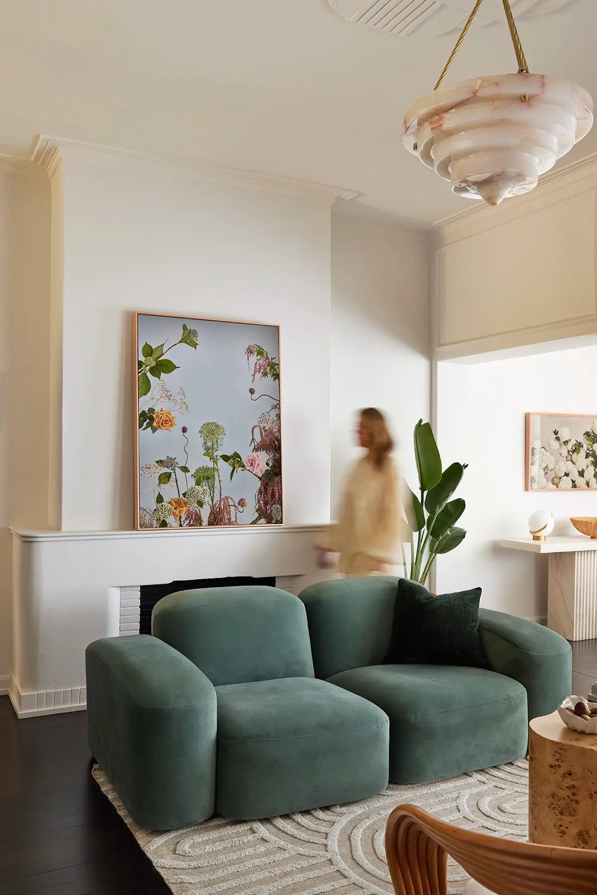
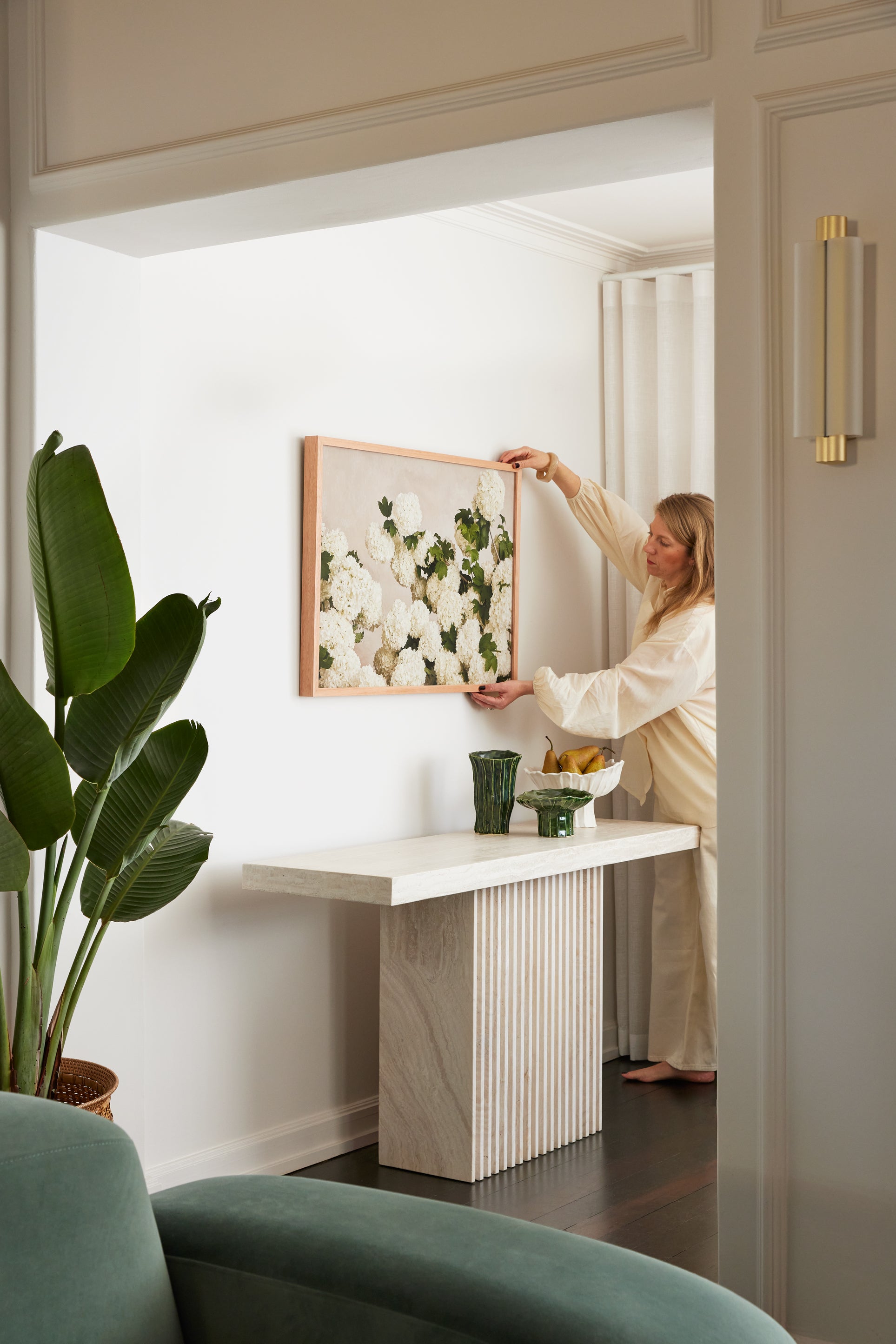
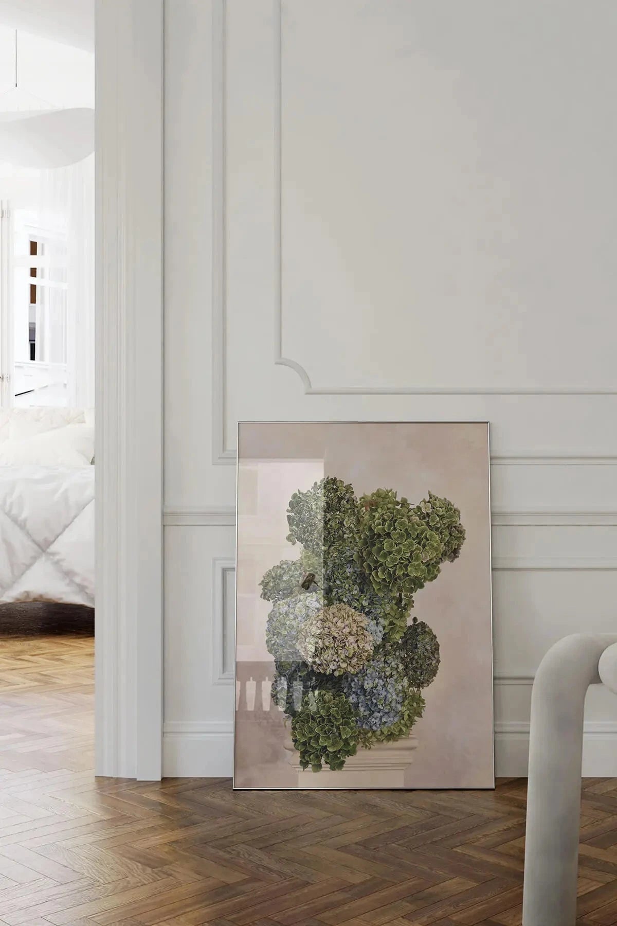
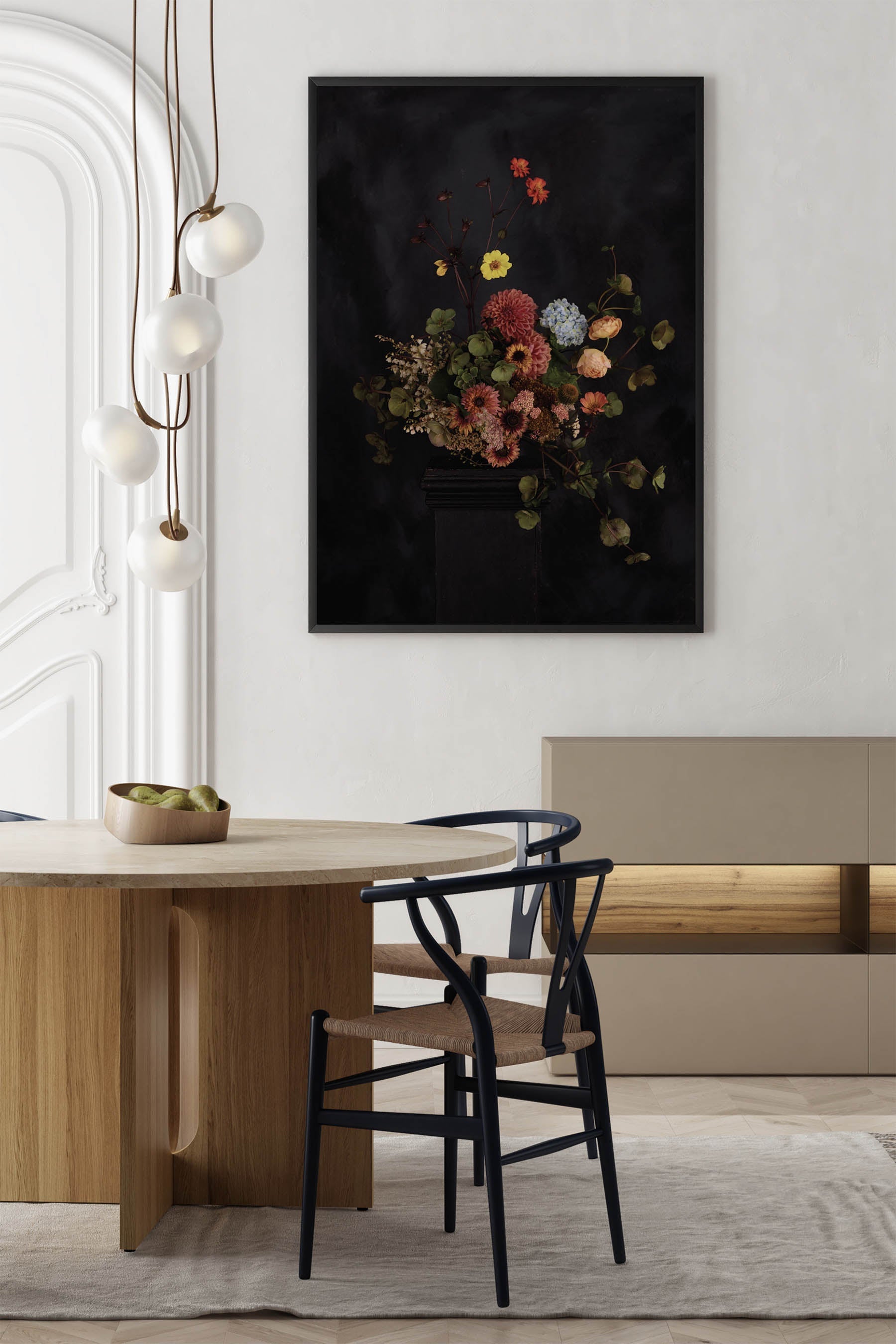
Du Calme suits a range of spaces. The soft palette and balanced compositions mean these prints rarely fight with existing decor — they tend to anchor it.
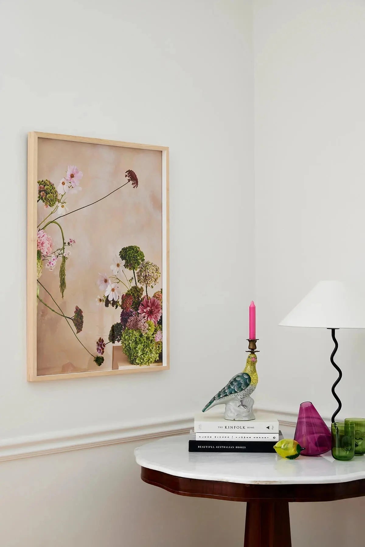
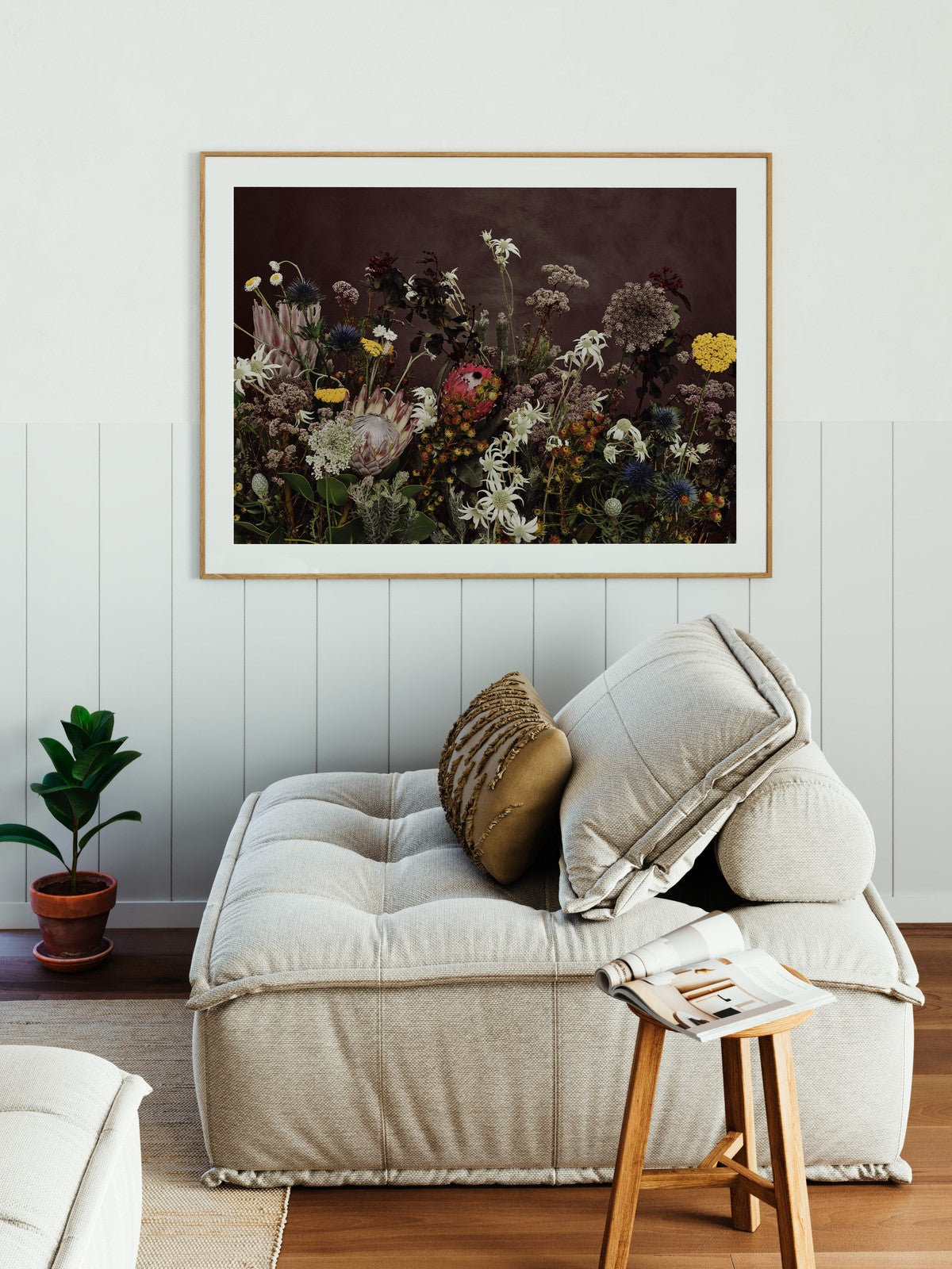
Living rooms
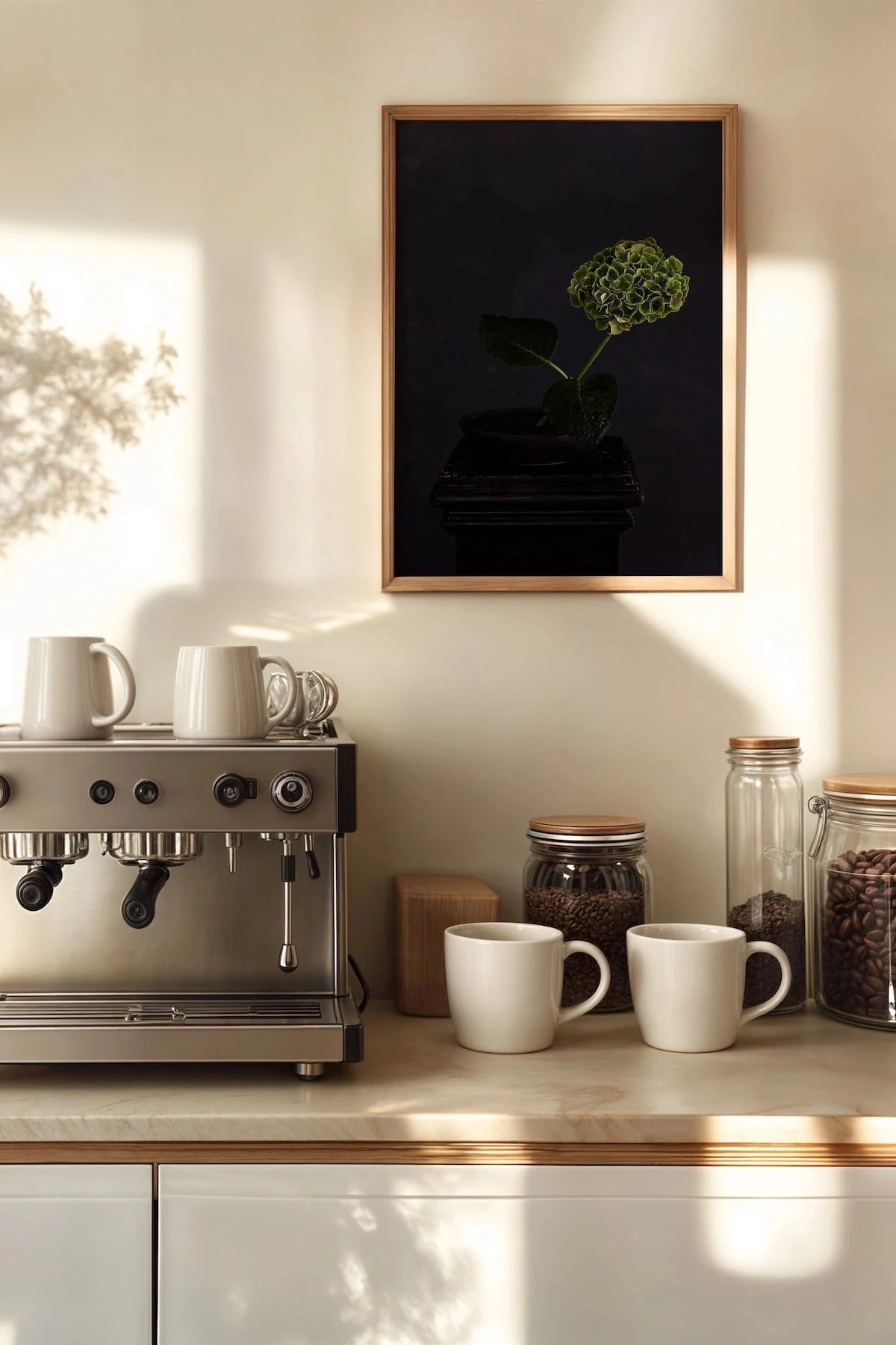
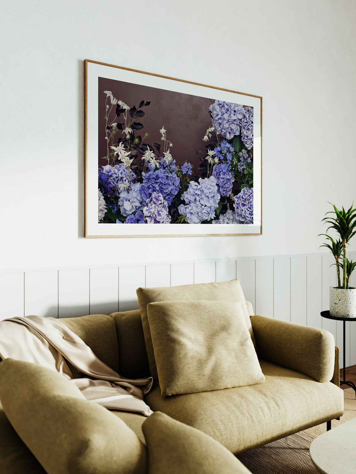
A single large-format Du Calme print above a sofa creates an immediate focal point. The blue tones work particularly well with warm neutral schemes. See living room wall art.
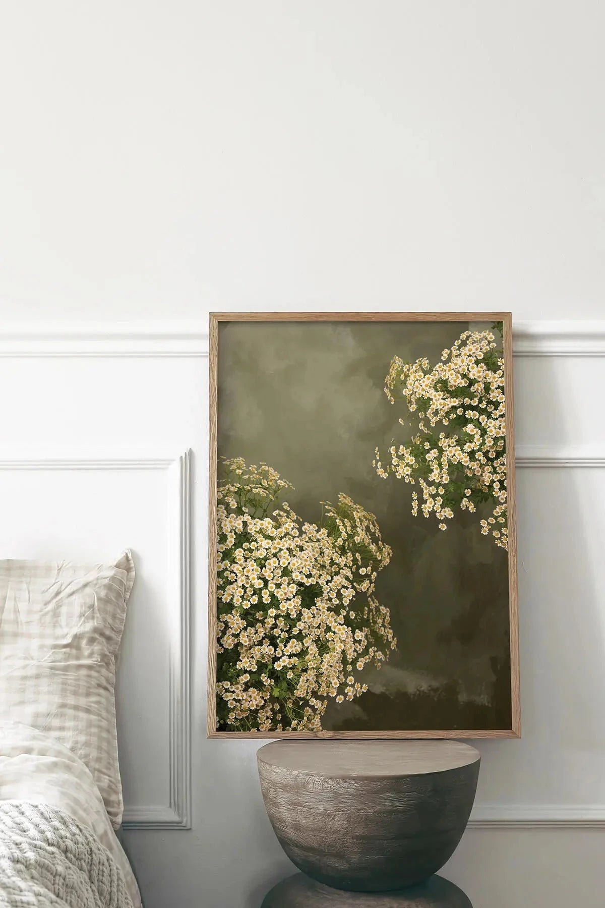
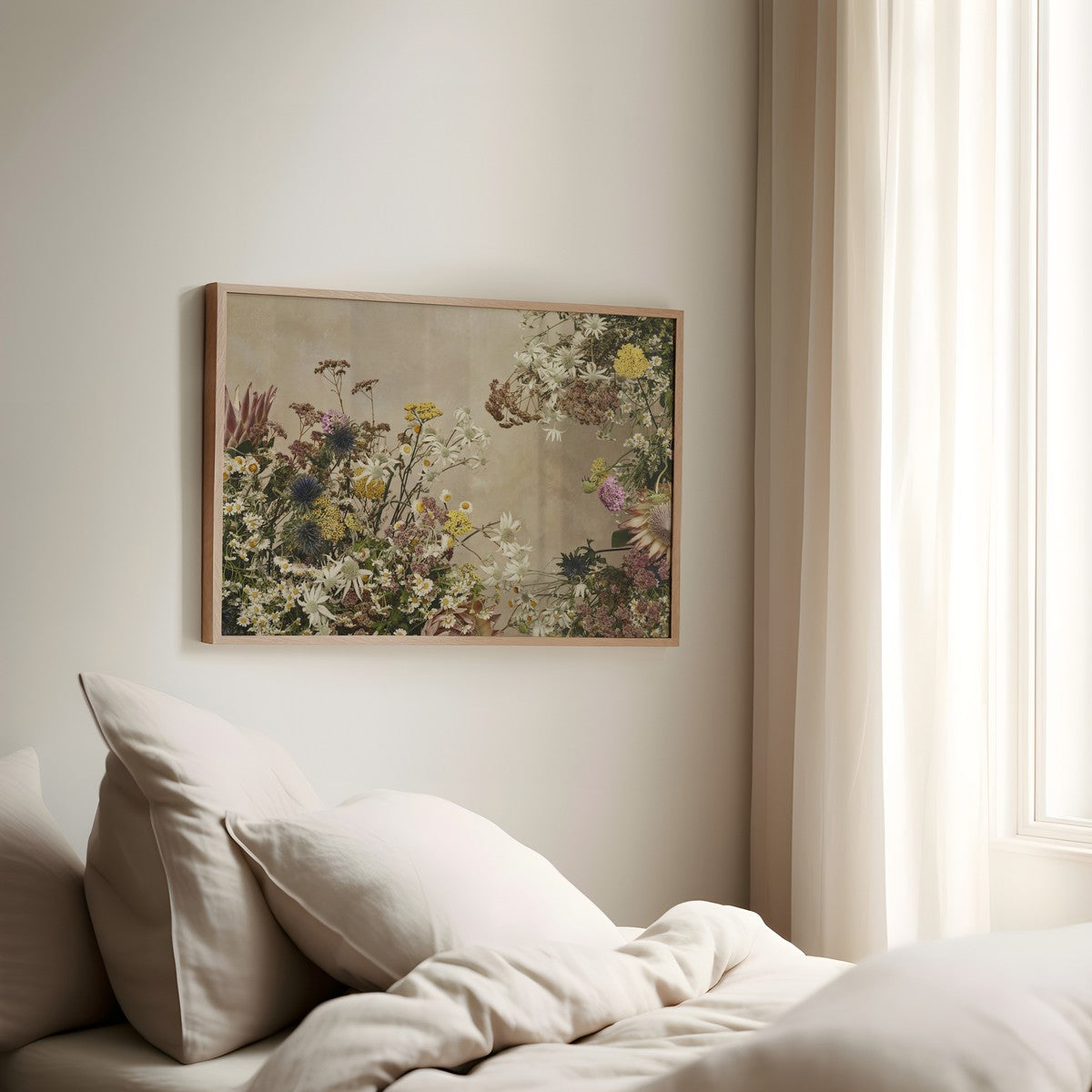
Bedrooms
The quieter compositions (Monet's Garden, Saint-Chapelle) bring exactly the restful tone a bedroom asks for. See bedroom art prints.
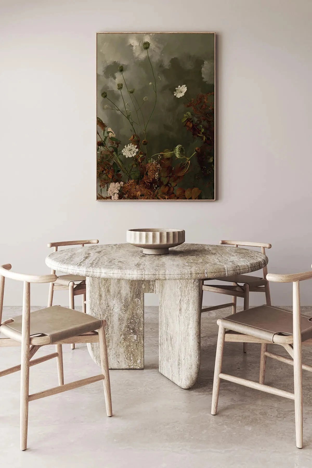
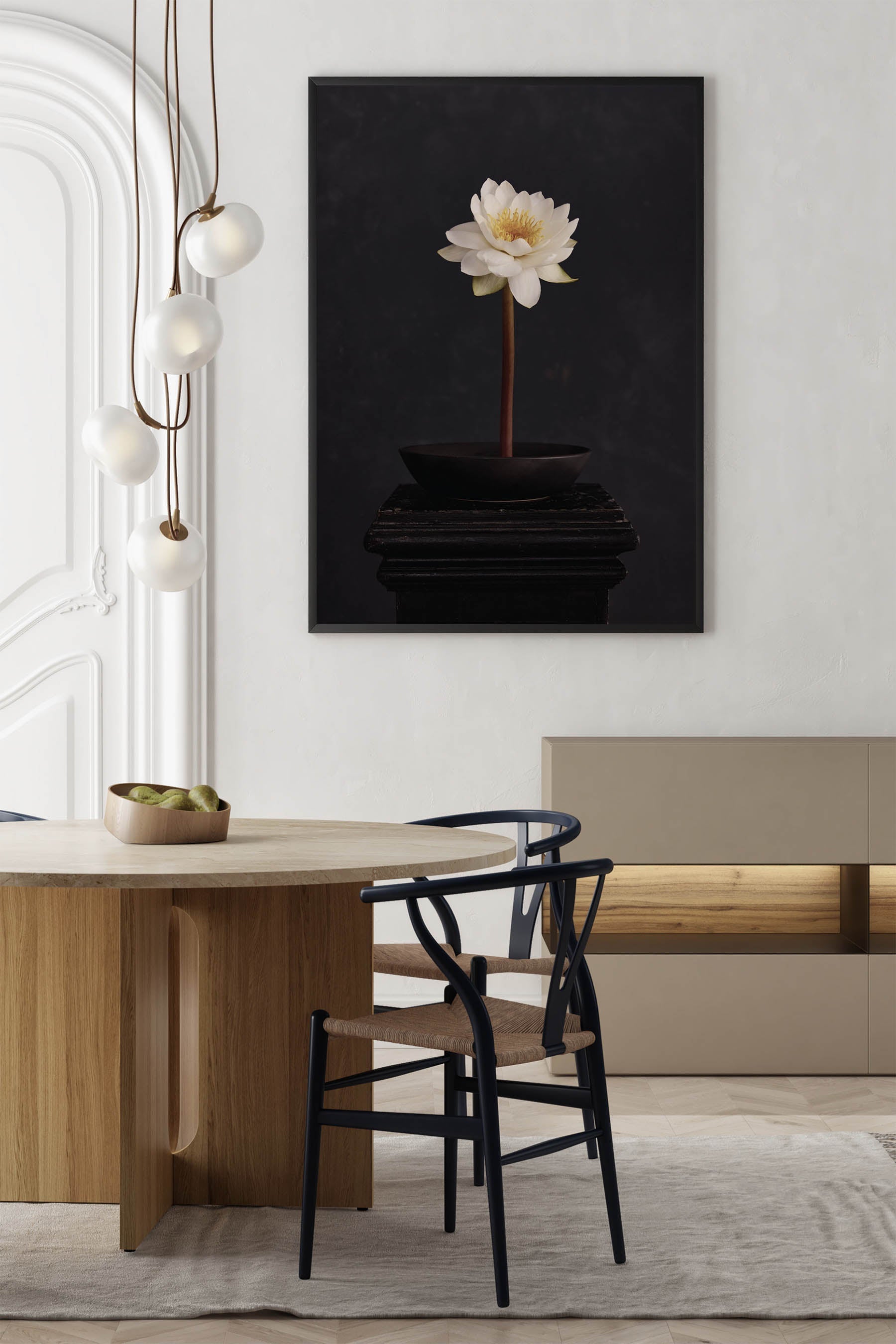
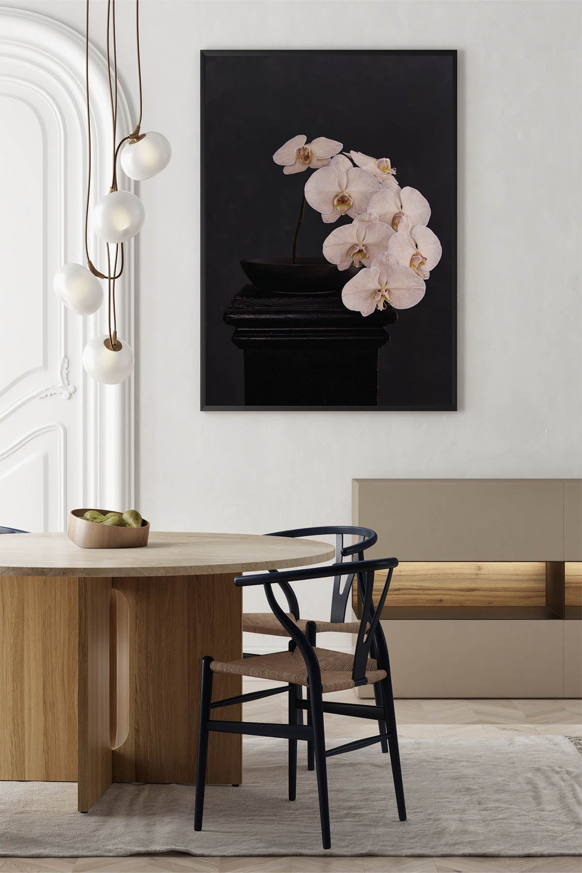
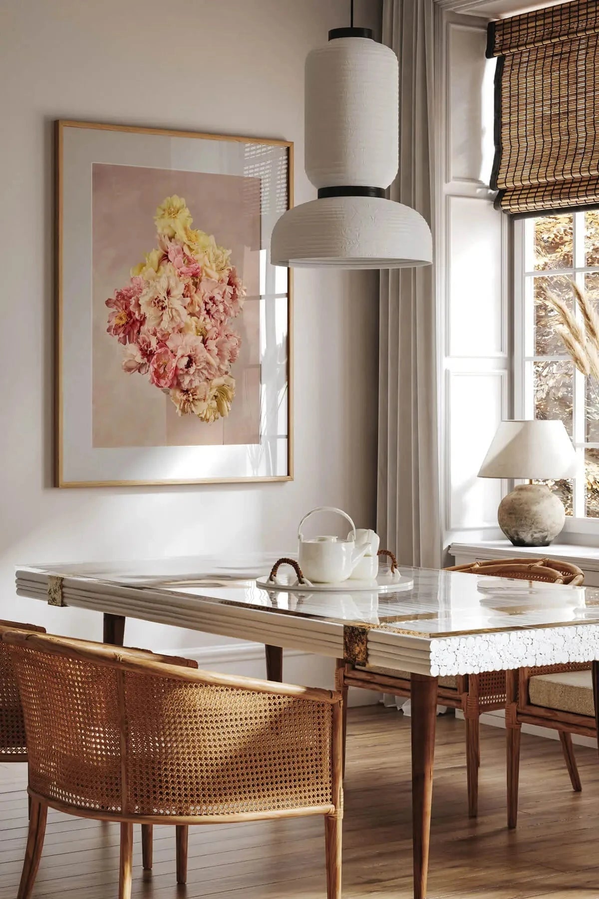
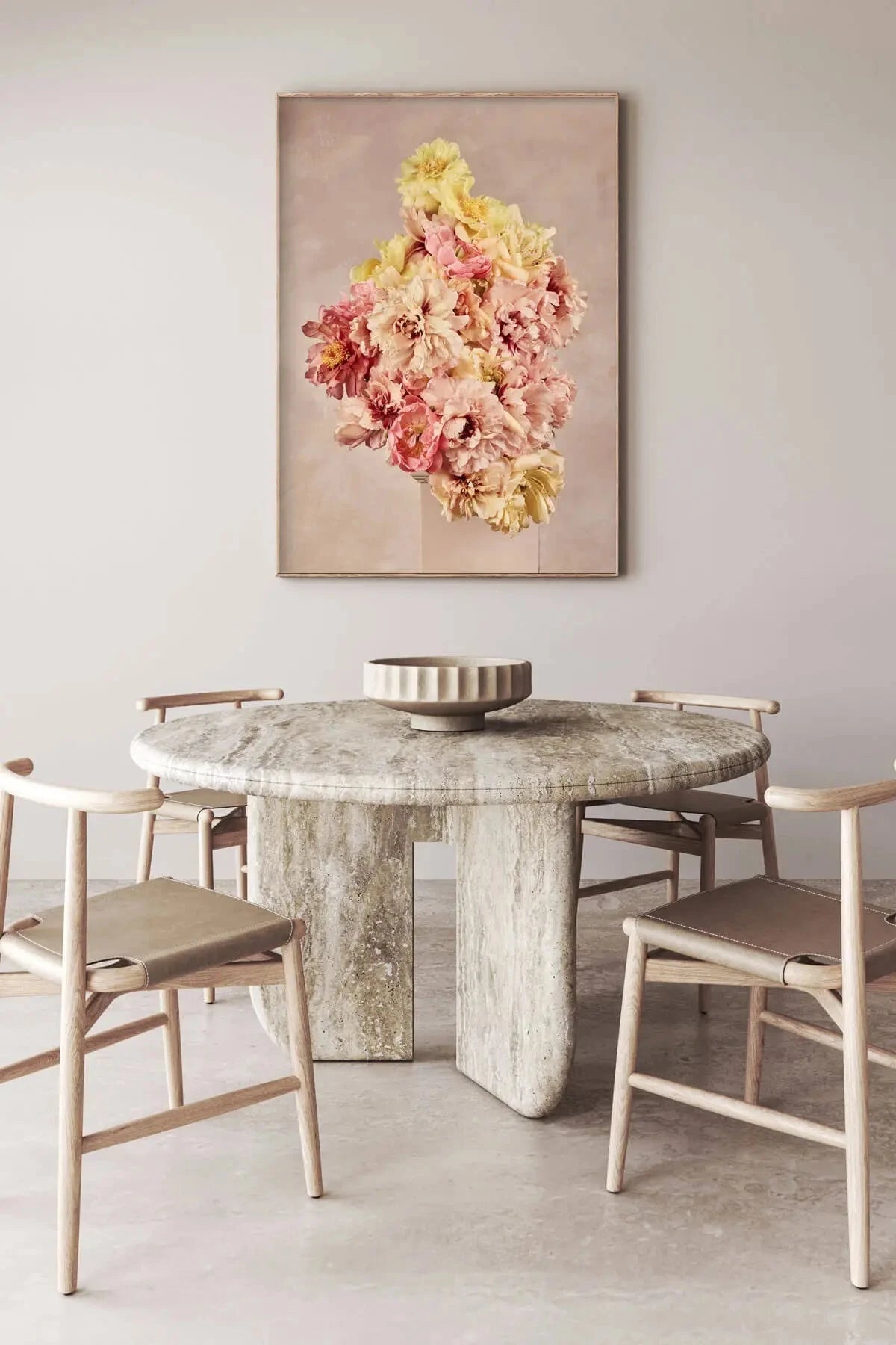
Dining rooms
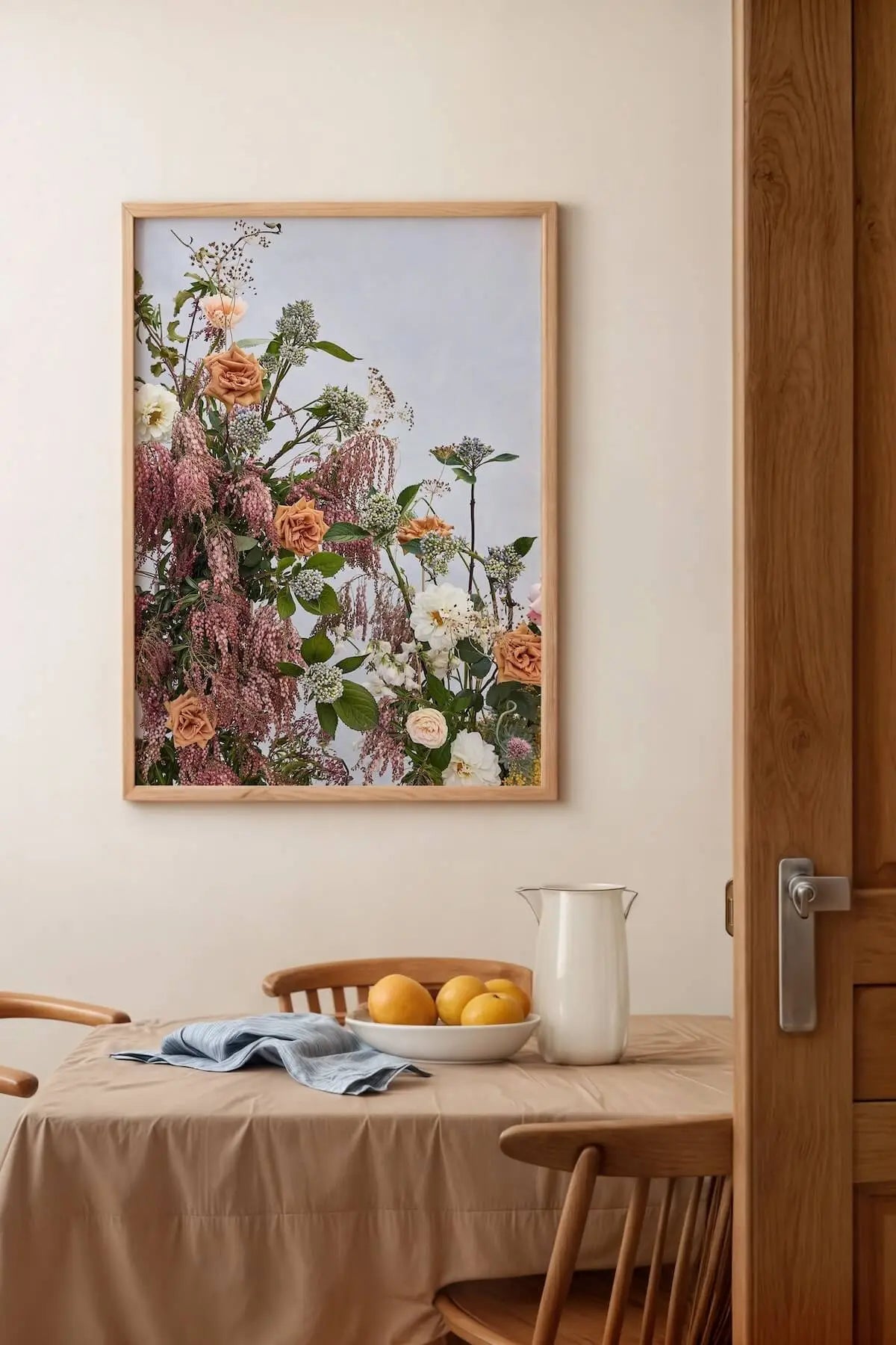
French art above a dining table sets a tone that needs no explanation. Pairs beautifully with candlelight. See dining room wall art.
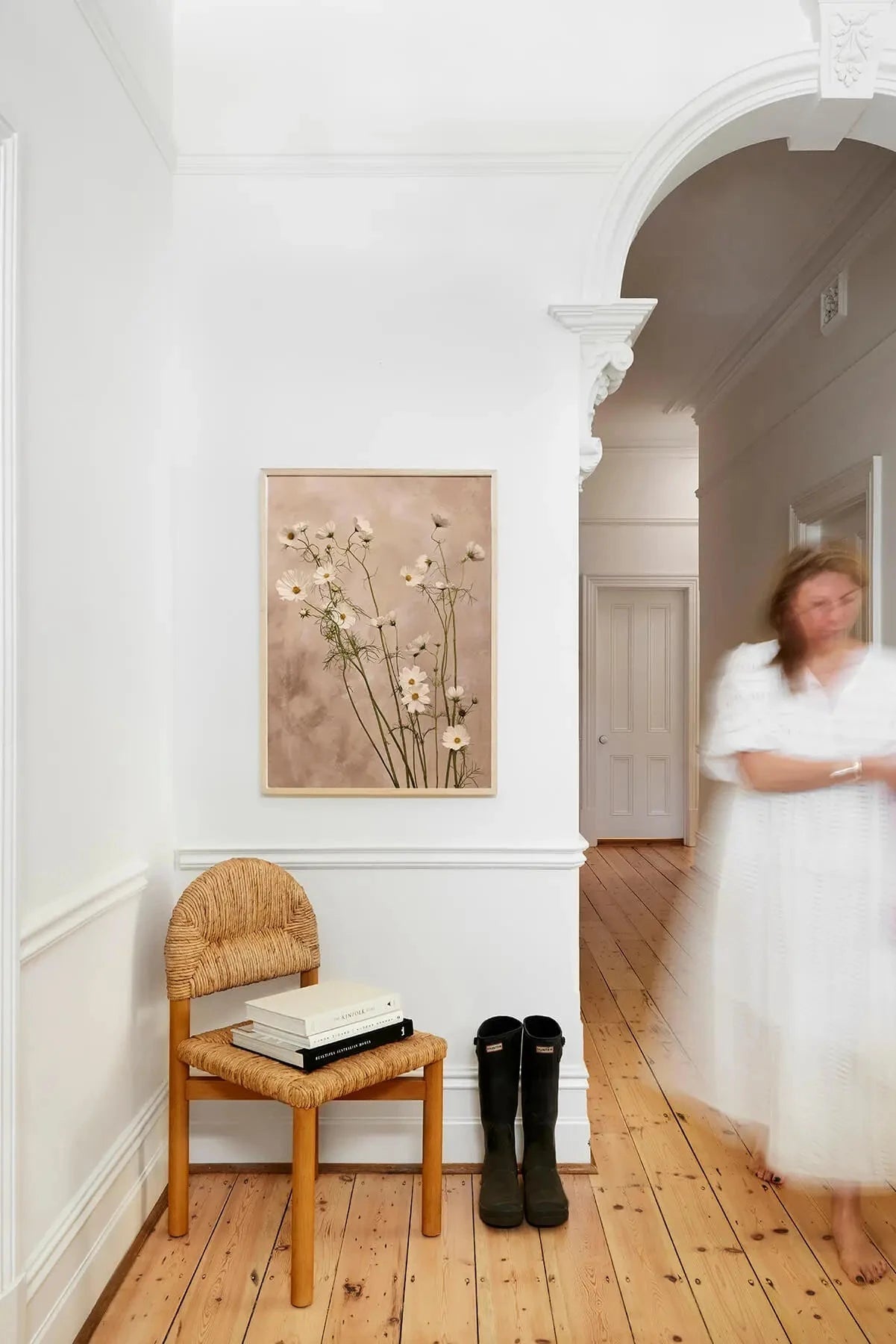
Hallways and entryways
A Du Calme print is a strong first impression without being loud. The vertical compositions suit narrow hallway walls well. See hallway art.
Kitchens
The botanical subject matter feels natural near gathering spaces. Canvas format handles kitchen humidity better than unframed paper. See kitchen art.
Part of the Story

Styling Du Calme
These prints pair naturally with warm timbers, linen textiles and muted metallics — brass rather than chrome, aged leather rather than polished. The collection works as a statement piece or as part of a gallery wall alongside other Austin Bloom prints.
For French-provincial interiors, the Natural Flooded Gum frame draws out the warmth in the blue tones. For a more contemporary setting, the Black stained frame gives the collection a gallery-weight presence. And for those drawn to the painterly quality of canvas, the visible weave adds a layer of texture that feels at home in this collection.
Point your phone at the wall — our view-in-room AR tool shows you any print at actual scale.
What Makes Du Calme Different
Hand-painted backgrounds: Each backdrop was mixed and painted by hand before any florals were composed.
Colour story: The palette was tested over weeks before the collection locked.
Named for real places: Every print references a specific French landmark.
Museum-grade materials: Built to hold colour for decades, not months. Your choice of satin-finish canvas or 310gsm cotton rag paper, both archival grade.
WORKING WITH CLIENTS?
Austin Bloom works with interior designers, stylists and architects. Trade pricing, dedicated account support and fast turnaround on custom orders.
Frequently Asked Questions
It translates loosely from French as "calm" or "stillness" — it describes both the palette and the feeling the collection is designed to carry into a room.
Du Calme prints are open editions, available while the collection remains active. Every piece is made to order on archival materials.
Cotton rag gives a smooth, photographic finish with exceptional colour accuracy — ideal for framing. Canvas adds visible texture and a painterly quality that suits the hand-painted aesthetic of this collection particularly well.
A1 or A0 for impact above a sofa or bed. A2 works well in bedrooms and hallways. Use our view-in-room AR tool to preview actual sizes on your wall.
Yes — the shared palette means any combination hangs cohesively. A pair of complementary pieces (e.g., Monet's Garden with Jardin du Luxembourg) creates a gallery effect without needing to match frames or worry about colour clashes.