
9 Style Guides: How to Style Fine Art Prints in Your Home | Austin Bloom
From our styling archive — originally shared October 2025
Looking for interior inspiration? Estée has created nine curated moodboards pairing Austin Bloom fine art prints with furniture and decor from Globe West, Cafe Lighting and more — each one a starting point for styling art in your own space.
---
Hello there!
I have created nine moodboards which combine our prints and styling elements, to use as inspiration and ideas for your space. Each one pairs one of our prints with furniture, lighting and textures that bring out the best in the artwork. I hope they help you see how our work might sit in your home.
With love,
Estée and Stu x
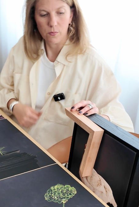
Austin Bloom photography by Jenah Piwanski
---

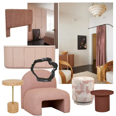
STYLE GUIDE 1
'Tender is the Stay' — featuring Full Moon
Soft but dramatic. Burgundy was a huge interior colour last year, but we are now seeing softer, more muted tones of brick and pale dusty pink. These tones in a bedroom have a calming effect. All furniture pieces here are Globe West.
Our Full Moon limited edition print is the hero, tying in the tones with a striking deep squid ink backdrop. This print works so well with black stained floorboards, bringing the floor tone up to eye level. We have used a black stained frame which gives strength to the print too. Full Moon is stunning as stretched canvas — no detail is lost.

STYLE GUIDE 2
'F. Scott Fitzgerald' — featuring Snowball Landscape
Velvet green teamed with the palest jade and natural tones is a surefire combination. This exquisite pendant light from Cafe Lighting and Living is such a statement to complement our Snowball Landscape. The stone and natural colours are a wonderful backdrop to soften strong green shades. All furniture pieces are from Globe West.
Snowball Landscape is the perfect choice above a bedhead and also above a sofa.

STYLE GUIDE 3
'The Mysterious Affair at Styles' — featuring Rose
Another example of how beautiful the softness of nude, cream and green work together. The kitchen in the images was captured in the most heavenly apartment called 'Tender is the Stay' by Atelier Bond — every detail was perfection.
Rose is a winner. From A3 to A0, she has such presence. I especially love Rose in the kitchen.

STYLE GUIDE 4
'Virginia Woolf' — featuring Bracken
Textural neutral on neutral is always a favourite. I adore this Her Hands pendant lamp. The combination of marble, wood and soft pulp light fitting gives a beautiful nude softness for the Bracken print.
The stretched canvas in Bracken is so moody — the canvas makes the print feel like an oil painting. Our prints are easy to style alongside other artwork, having palettes that are versatile.

STYLE GUIDE 5
'A Room of One's Own' — featuring Wild Cosmos
Our Wild Cosmos print has a beautiful depth — tones of stone, neutral and even a little hint of very soft brick and coffee. It is tonally perfect with the Hugo Monte Sofa Chair in Sunstone from Globe West.
Wild Cosmos is one of our top-selling prints alongside Chamomile and Bracken. This print framed with our Flooded Gum Natural frame is so calming.

STYLE GUIDE 6
'Moments of Being' — featuring Rose
Rose never fails to make me smile. If you have a white and black interior with some copper and teak accents, this print will instantly feel at home. It has a strong presence. Stretched and framed in canvas with our 55mm depth stained black frame is a must — no need for glass, the canvas is the perfect medium.

STYLE GUIDE 7
'The Saint in New York' — featuring Forage
Choosing a copper sink would have to be one of my 'to-dos' in this lifetime. A renovation in a New York apartment with sleek features in the kitchen sounds like a lot of fun.
Our Forage print is perfect for a space that embraces rich warm chocolates, copper and earth shades. This print was designed with flowers from my father's garden, my mother-in-law's and my dear friend Tess. There may have also been some over-the-fence foliage clippings too. Each of our prints is designed with heart and every flower holds a close meaning.

STYLE GUIDE 8
'The Great Gatsby' — featuring Cosmos
Nothing like a stripe, especially in the 1920s era of The Great Gatsby. Austin Bloom has a serious love affair with stripes.
Looking for a pairing or trio in neutrals? We would highly recommend Cosmos, Forage and Wild Cosmos. We are also loving this Mocka Ted Occasional Chair. Our prints can always do with a stripe curtain or upholstered furniture in the same room.

STYLE GUIDE 9
'The So Blue Marble' — featuring Dutch Masters #2
Strong lines with an art deco meets mid-century feel. Nothing like a powder blue (Miu Miu blue) paired with a strong burgundy and chocolate. Believe me, it is all coming back.
I have paired these tones with our still life print — Dutch Masters #2. I love the way all the colours speak to each other. It is important to have furniture pieces that pop colours from your wall art — it creates such a good synergy. A throw rug or cushion can help to draw out colours in the room. All furniture in this moodboard from Globe West.
HOW TO CREATE YOUR OWN MOODBOARD
Start with what you love
Building a moodboard is one of the best ways to take the guesswork out of decorating. Start with the print you are drawn to, then pull in furniture, textiles and lighting that share its tonal palette. You do not need everything to match — you want a conversation between the pieces, not a uniform.
Free tools like Style SourceBook let you drag and drop products from Australian retailers into a single board, complete with pricing. Or try our View in Room tool to preview prints on your actual wall before committing to a colour direction.
FINAL THOUGHTS
Share yours! @austinbloom.adelaide
We hope these moodboards give you ideas for your own space. If you would like help choosing prints or styling your walls, we are always here to help.
Contact us for a free styling consultation.
★★★★★
"A stunningly beautiful print. Looks even better in real life. Communication and ordering process excellent. Print arrived securely and in protective packaging. The wrapping enabled easy relocation into a frame — something I was at first fearful of but super easy. Very, very happy with purchase. Thanks Estée and Stu."
Jacqui C. — Verified buyer, Velvet Green - Ramble
You Might Also Enjoy
- How to Style 'Rose' in Your Home
- Your Guide to Framing Fine Art Prints
- Chamomile Inspiration: Styling Our Most-Loved Print
WIN A FRAMED A3 PRINT — EVERY WEEK
Each week we give away a beautifully framed A3 fine art print to one subscriber. Join our mailing list for your chance to win, plus early access to new collections and styling inspiration.
No spam, just art. Unsubscribe anytime.
