

Du Calme: Our French-Inspired Art Collection | Austin Bloom
From the studio — originally shared November 2025
Inspired by De Gournay, Parisian interiors and hand-painted provincial chateaus, our Du Calme Collection is a meeting of nature, design, colour and stillness. Here is the story of how it came together.
---
Hello there!
We have been creating something new in the studio — pieces that carry calm, depth, joy and memory. Think blue skies with balanced neutrals and space to breathe. We blended several blue paints as the backdrop for this collection and found the beautiful Haymes paint colour 'Calm Down', which set the tone for the entire release. The colour palette felt distinctively French.
With love,
Estée and Stu x
---

THE INSPIRATION
De Gournay, Parisian interiors, provincial chateaus
Inspired by De Gournay, Parisian interiors drenched in floor-to-ceiling wallpapers and delicately hand-painted walls that adorn provincial chateaus, we intended this collection to become wallpaper. We are still working on super-large-scale formats, but for now we are offering our evergreen sizes from A4 to A0.
THE PROCESS
Built slowly, by hand
In true Austin Bloom style, each piece began as a simple sketch, then came to life through our hands. We built it slowly — painting backdrops, adding florals and layers until it felt right. The process was unhurried and intentional, which is exactly the feeling we wanted the finished work to carry.
THE COLOUR PALETTE
Calm Down blue and beyond
Colour sets the emotional tone of a collection before a single flower is added. For Du Calme, we tested dozens of blues before finding the Haymes paint 'Calm Down' — a dusty, heritage blue with enough warmth to feel inviting rather than cold. It reads differently depending on the light: cooler and quieter in the morning, richer and deeper by evening.
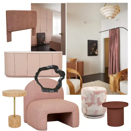
Against this backdrop, the florals carry a softness that would be lost on a stark white or pure black ground. The blue holds them gently, the way a French linen tablecloth holds the objects placed upon it. We paired it with balanced neutrals — cream, stone, soft grey — to ensure the collection sits comfortably in both modern and traditional interiors.
THE VISION
Warmth and quiet refinement
Our vision for this collection is to bring warmth and quiet refinement into your space — a meeting of nature, design, colour and stillness. We have carefully combined antique and modern influences, allowing each piece to suit any space.
STYLING DU CALME
How to bring French calm into your home
Du Calme prints pair naturally with warm timbers, linen textiles and muted metallics — think brass rather than chrome, aged leather rather than polished. The collection works beautifully as a statement piece above a bed or sofa, but it is equally at home as part of a gallery wall alongside other Austin Bloom prints.
For French-provincial interiors, our Natural Flooded Gum frame draws out the warmth in the blue tones. For a more contemporary setting, the Black stained frame gives the collection a gallery-weight presence. And for those drawn to the painterly quality of canvas, the visible weave adds a layer of texture that feels very much at home in this collection.
Use our View in Room tool to preview any Du Calme print on your actual wall.
Available on canvas and cotton rag
Every piece in the Du Calme Collection is available on both satin-finish canvas (ready to hang) and museum-quality 310gsm cotton rag (frameable). Both are printed with archival pigment inks — the colour depth of 'Calm Down' blue holds beautifully on either substrate, though canvas adds a painterly texture that suits this collection particularly well. Compare formats and materials →
FINAL THOUGHTS
Share yours! @austinbloom.adelaide
We are so glad you are on this journey with us. If you have brought a Du Calme piece into your home, we would love to see how you have styled it — tag us at @austinbloom.adelaide.
You Might Also Enjoy
WIN A FRAMED A3 PRINT — EVERY WEEK
Each week we give away a beautifully framed A3 fine art print to one subscriber. Join our mailing list for your chance to win, plus early access to new collections and styling inspiration.
No spam, just art. Unsubscribe anytime.